
- Type
- Brand strategy
- Brand identity
- Venture design
- Client
- Made of air
- Jun – Aug 2021
- My role
- Creative direction
- Art direction
- Visual identity
- Motion design
Made of air
By recycling bio-waste from forests and farms around Berlin, Made of Air — a small Berlin based startup — has developed a new carbon negative thermoplastic. The material stores more carbon than it emits, making it a perfect replacement for fossil plastics across industries and dramatically reducing the carbon footprint of the products using it.

00 · Project summary
Challenge
In preparation for their next stages of growth, Made of Air needed a new brand strategy to help them align internally and establish a consistent, recognisable and memorable presence across all verbal, visual and material embodiments of the brand.
Outcomes
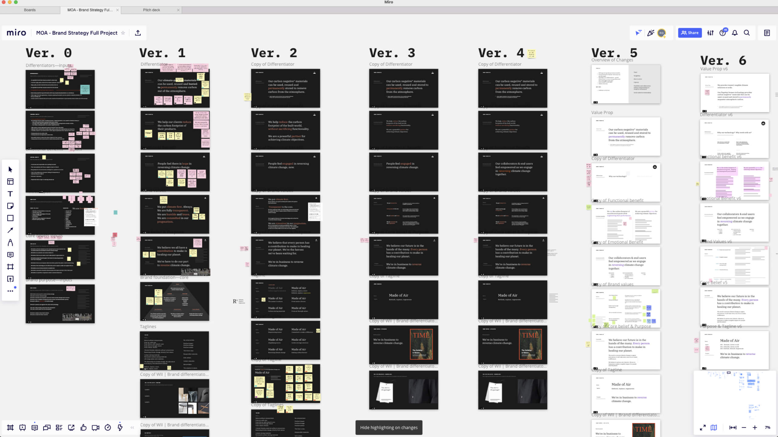
At the end of a 10-week project, we’ve delivered a full foundational brand and communication strategy, together with a new brand identity and visual language. We’ve revisited the storytelling of Made of air’s existing website and redesigned it to reflect the rebranding.
Listen to podcast Visit siteImpact
- After the rebrand and splash page relaunch the website traffic increased by:
- 430%
- Whithin a year Made of air's team has more than doubled its size.
- 280%
Full credits
- 3D and visual support
- Camille Chouard
- René Mambembe
- Project management
- Mattia Tarizzo
- Strategy and service design
- Seshmitha Vedachalam
- Zuzana Peskova
- Nieves Padilla
01 · approach
Remote, collaborative, challenging and fun
In the midst of a global pandemic, I’ve led a fully remote European team of designers and strategists throughout a collaborative and fast-paced 10-week project. The approach spanned across 4 main stages of development: immersion, brand foundation, brand identity and brand expression.
02 · immersion
Becoming a carbon expert in two weeks
During the first couple of weeks, the team soaked everything there was to know about carbon, particle emissions, end-of-life cycles of thermoplastics, what competitors are doing, adoption criteria for manufactures, and lastly, what partners and clients are looking for when engaging with climate start-ups.
An intense process of desk research, stakeholder interviews, client workshops and internal alignments set up the knowledge foundation for a successful program.
03 · Brand strategy
Crafting a brand foundation together
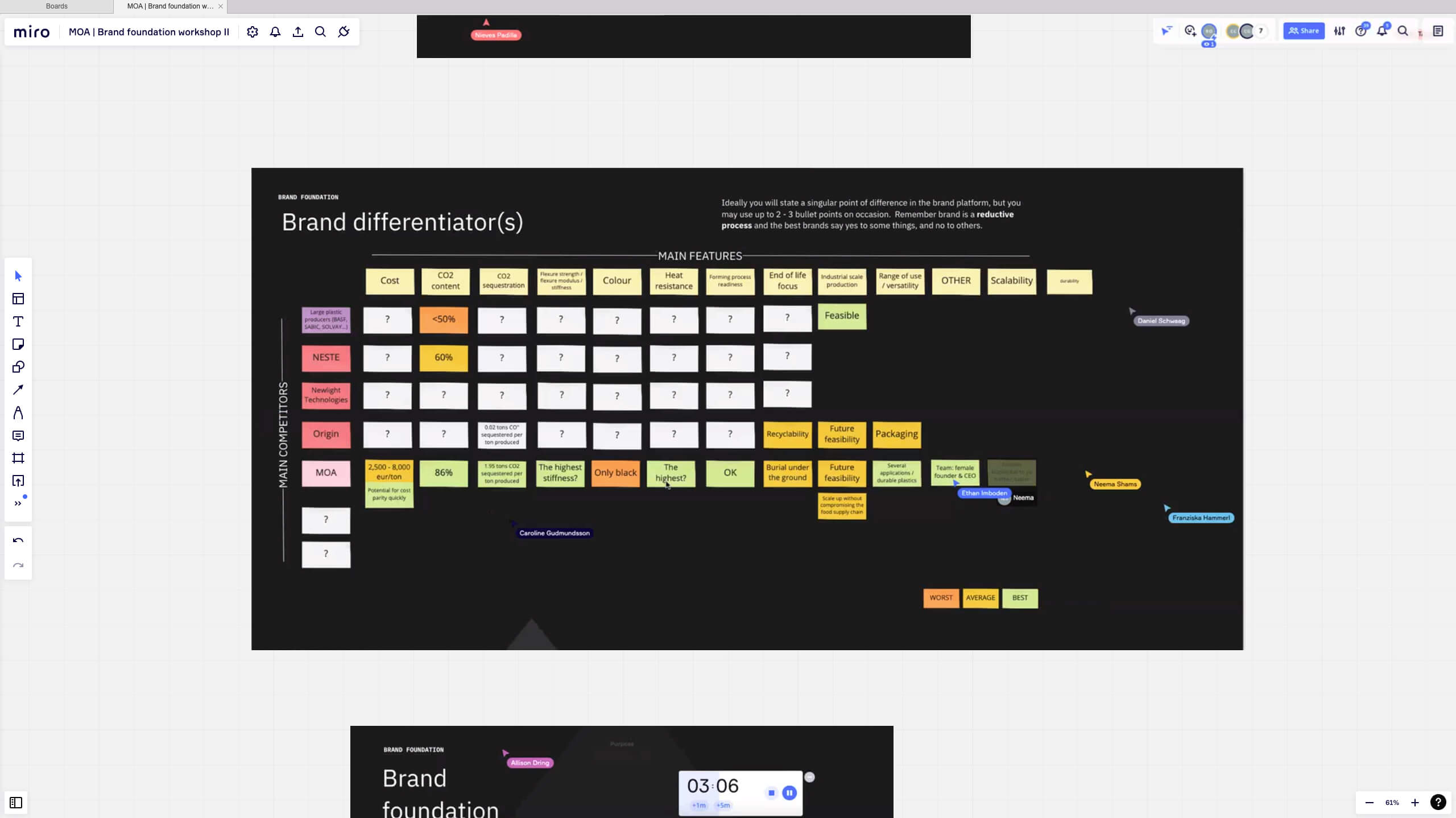
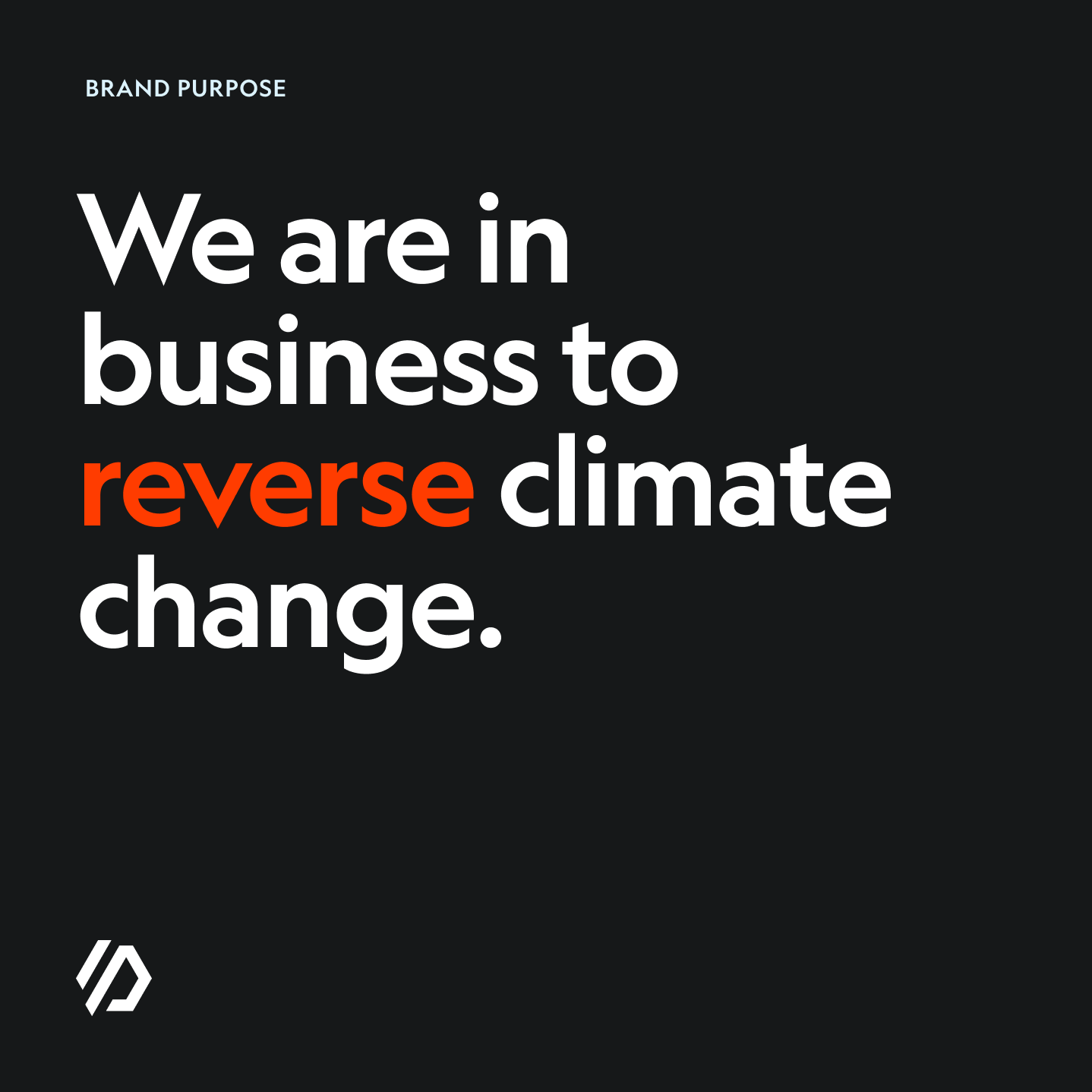
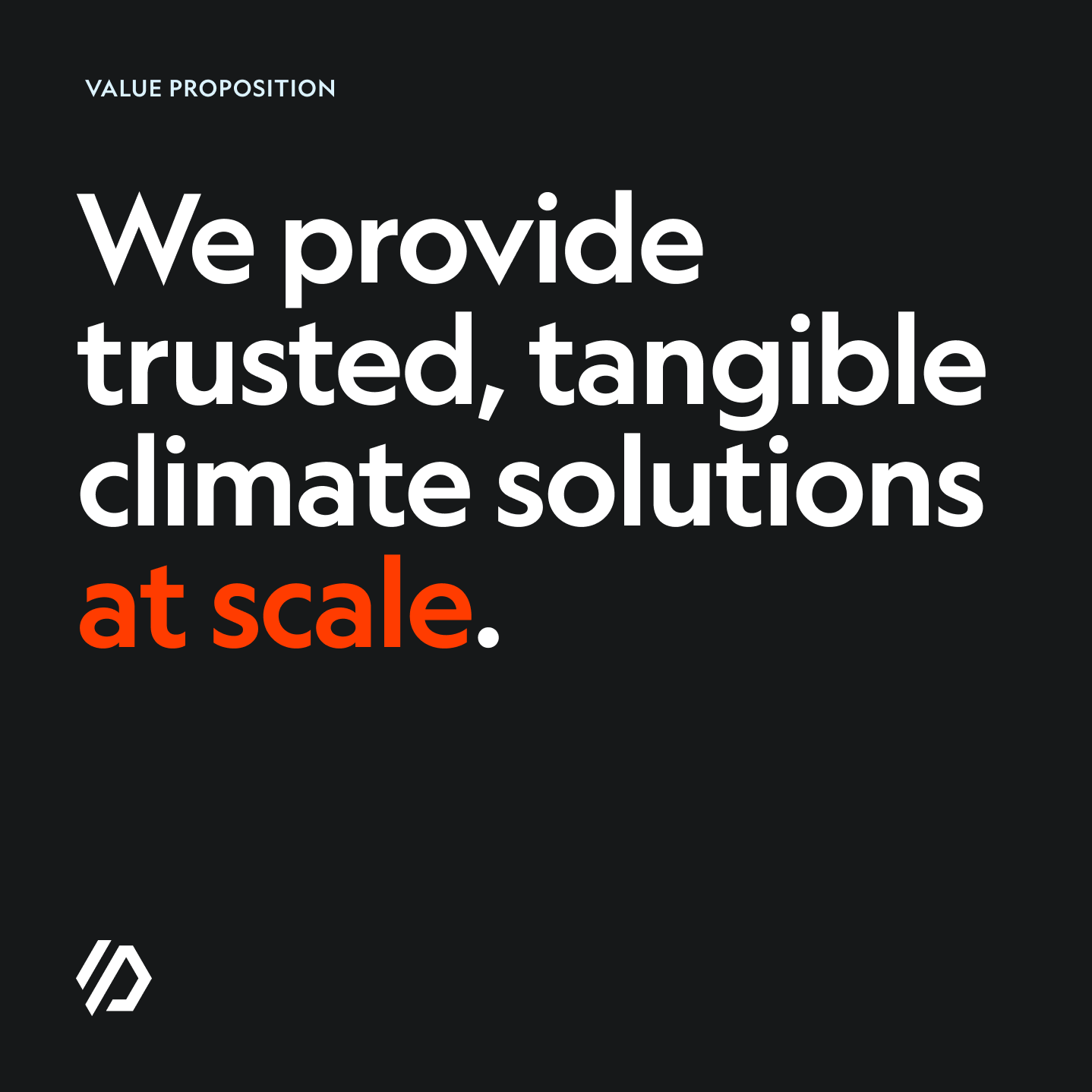
Made of Air’s value to a product is not merely a thermoplastic replacement, it fundamentally reduces the carbon footprint of any product, actively contributing to reverse climate change. For us, the main challenge was how to communicate its value as an ingredient brand to big brands, while being crystal clear and fully transparent towards the end-consumer.
Made of air does not capture carbon directly from the atmosphere — as the name might imply. It locks the carbon that has been capture during the lifetime of a tree forever. The forever is only true once the material's end-of-life responsibility is ensured. Which means, in order to truly prevent the re-release of the stored carbon, the material needs to be buried and decompose underground.
MOA as an ingredient brand
The material flexibility and highly adaptability across industries, exposes it to a wide variety of end-consumers, who may or may not be familiar with the material. The need for a consistent narrative and visual communication across all these different products and industries, made our work really hard, but was paramount in the creation of a solid brand strategy foundation.
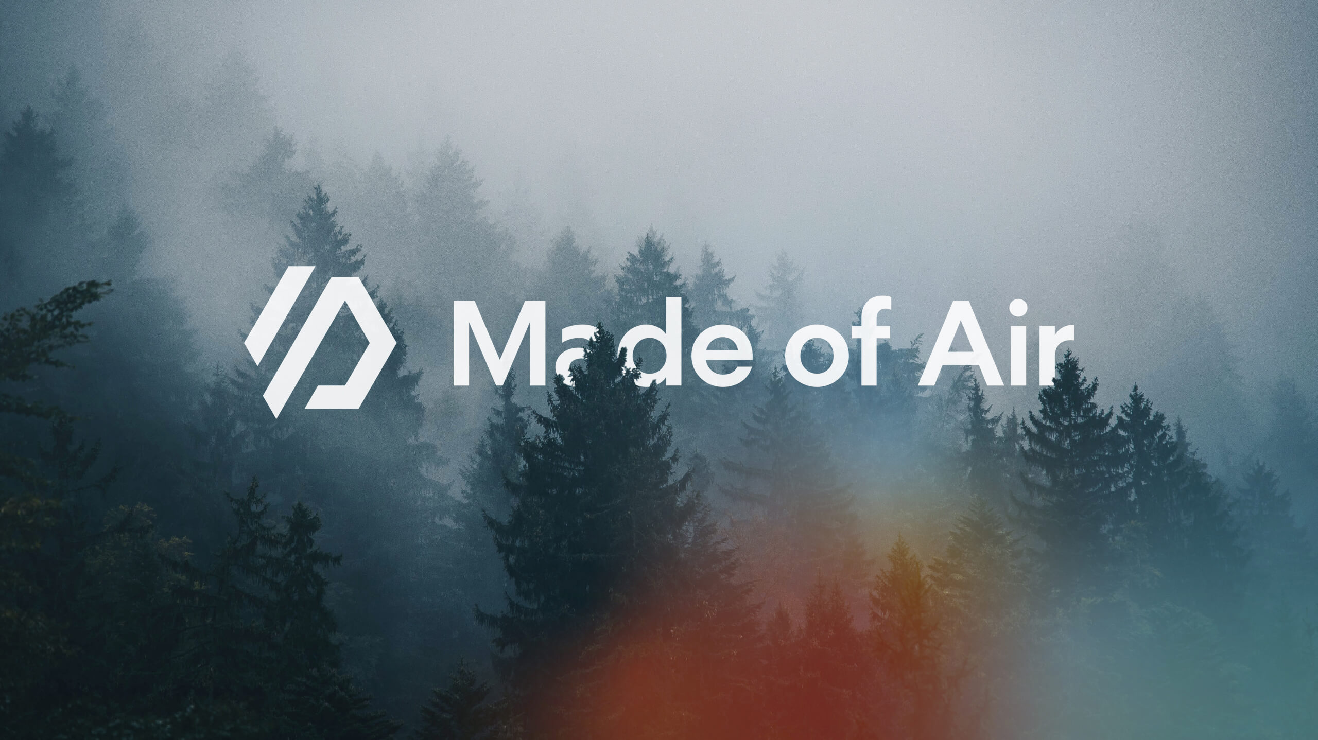
04 · Brand identity
Reverse climate change. Sink carbon to the ground. Forever.
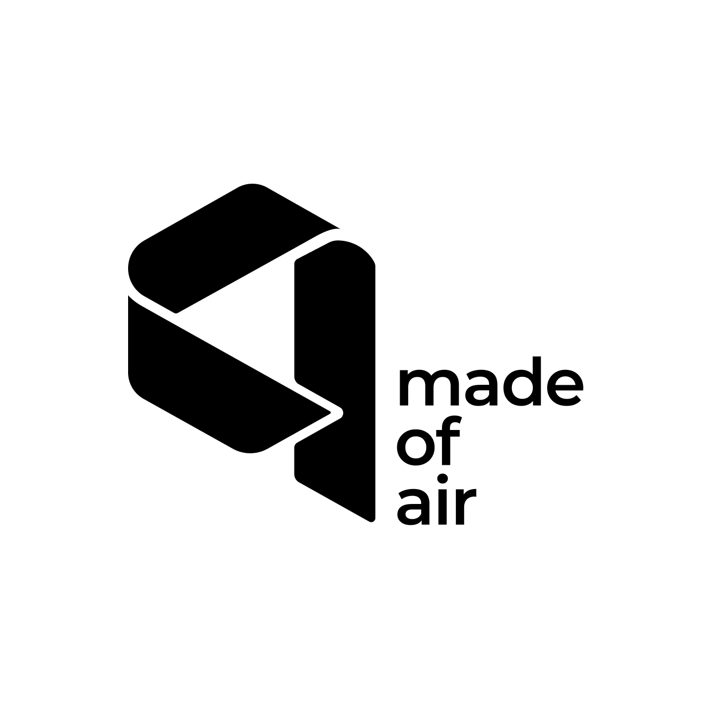
Before the project started, I did not anticipate redesigning the logo for Made of air — from what we’ve learned during our stakeholder interviews, nobody seemed to have an issue with the current logo execution.
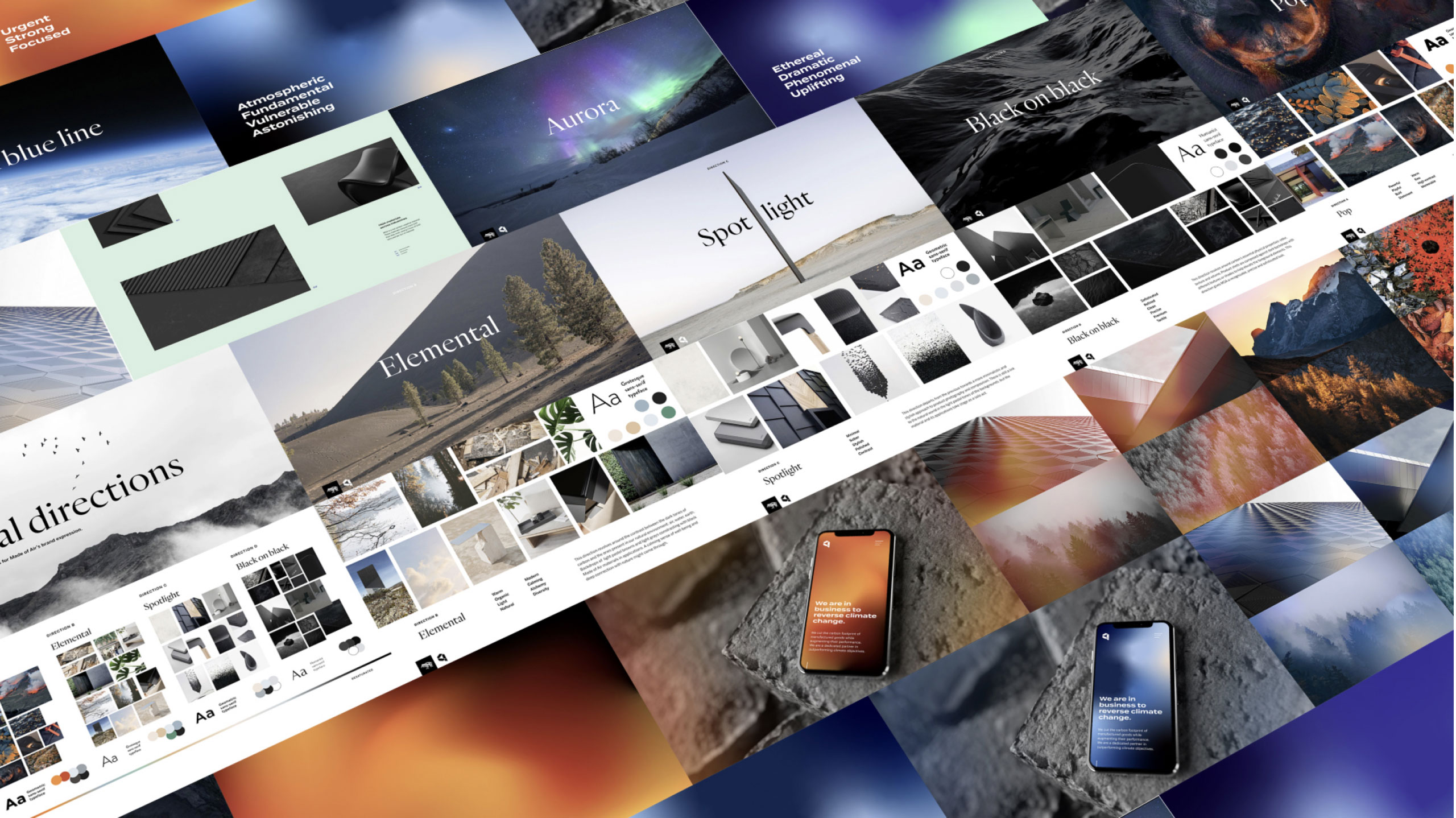
As we progressed and started creating mood boards to identify possible brand visual directions, based on the work developed during the brand foundation work, things turned out differently…

Finding the right mood and visual tonality
From the very beginning, Made of Air explicitly mentioned they did not want to become a commodity, nor a life-style brand. We went through some rounds of moodboards with the Made of air team, until we've finally found the right visual tonality.
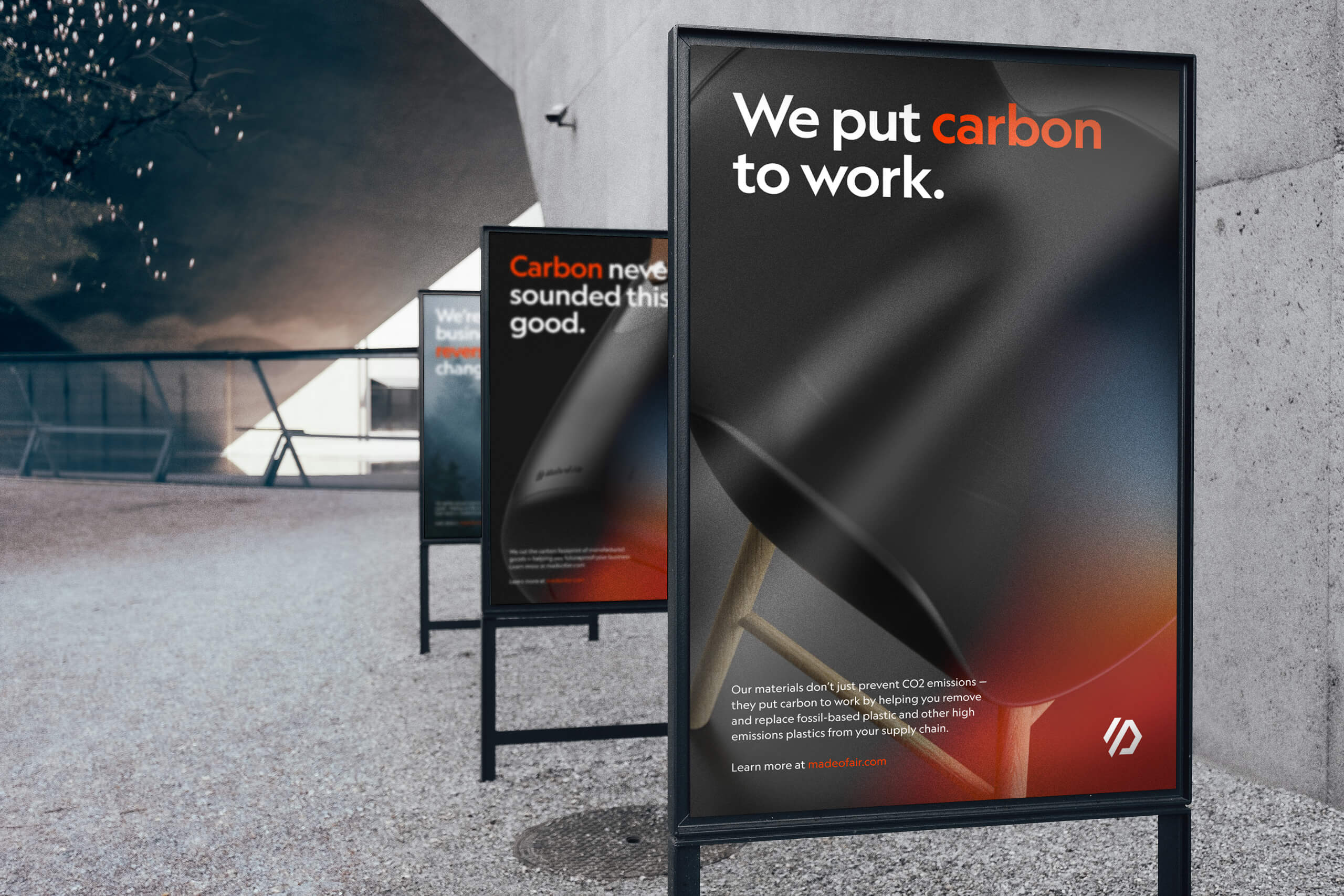
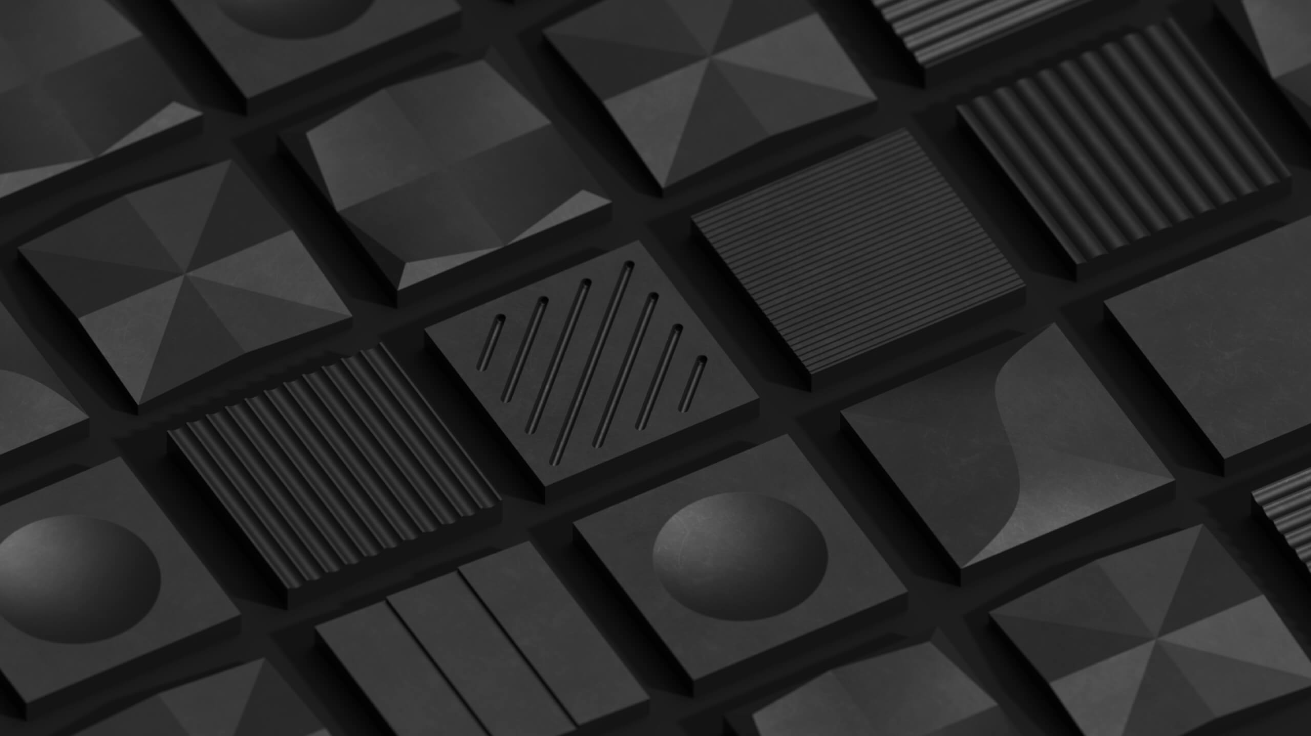
Colour
We've focused of the material properties, its Java-like blackness and volcanic texture. In order to convey a sense of urgency in action towards climate change, we've adopted a lava red, that pops a strong high-contrast against the material.
As a secondary accent we looked towards finding the opposite to lava in nature: the fragility of glaciar ice.
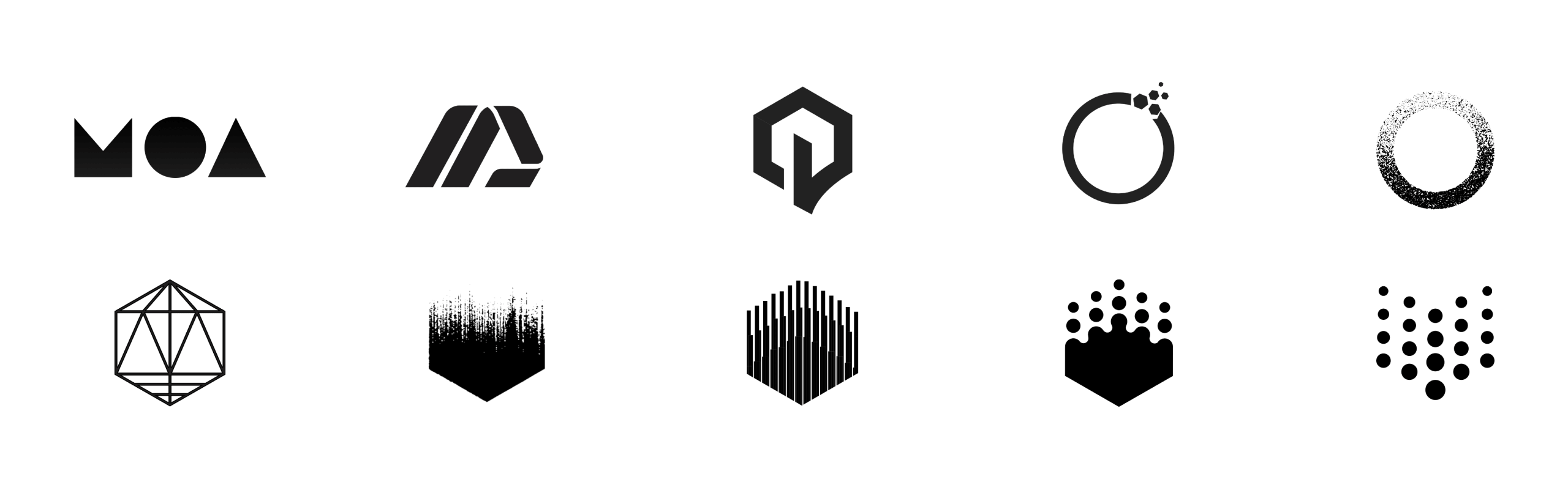
Earlier mark explorations
A few of the explorations executed before reaching the final design
Challenging the Church of circularity
Made of air's existing identity was based on Gary Dean Anderson's recycling mark from 1970 — the three looping planar arrows. The original intent was to break the Möbius strip and end the cycle pointing down.
Our approach was to challenge the incremental evolution of previous recycling models, and take a disruptive approach, one that aims to reverse instead of maintain the cycle through an existing problem.
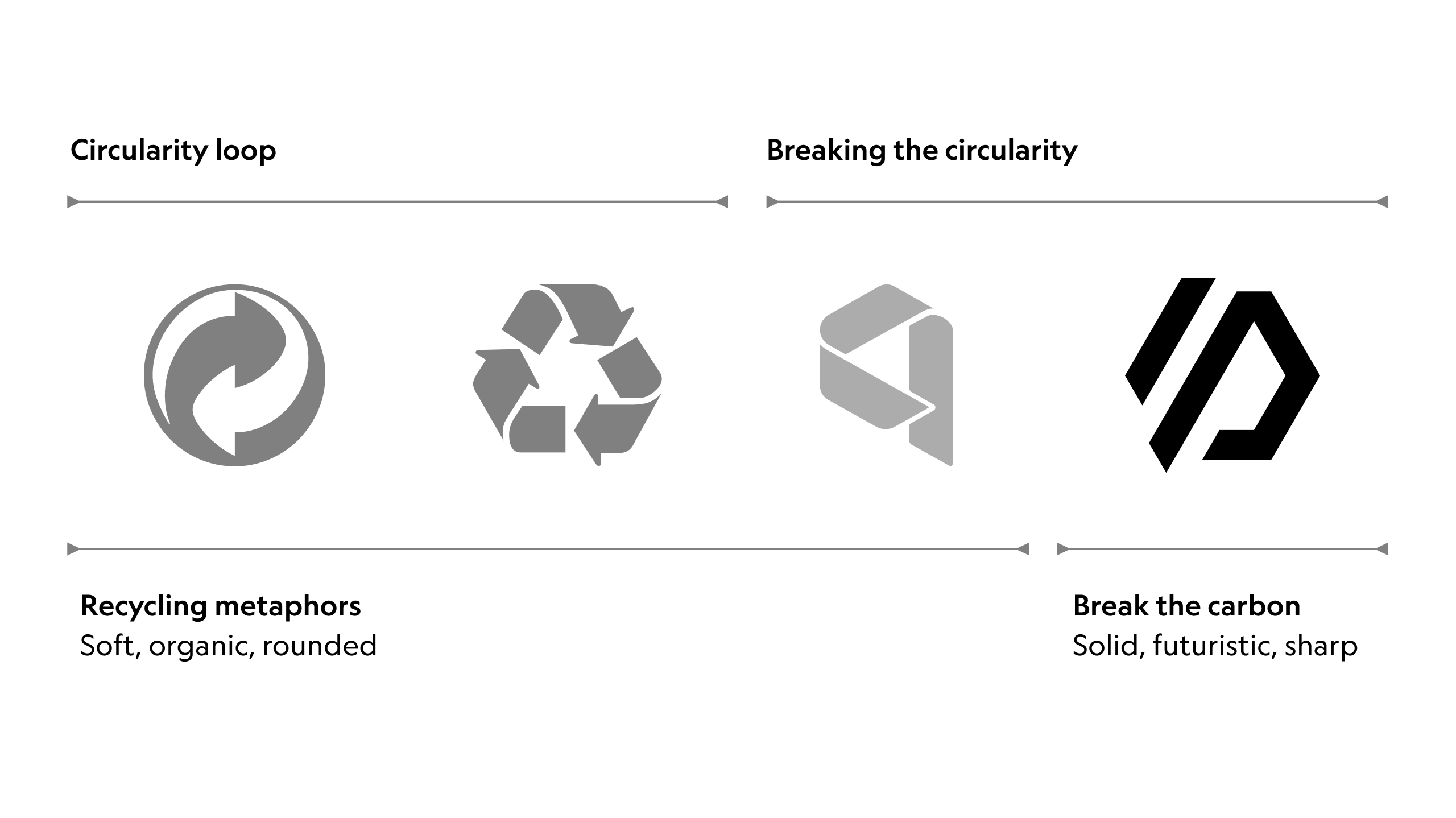
A new paradigm
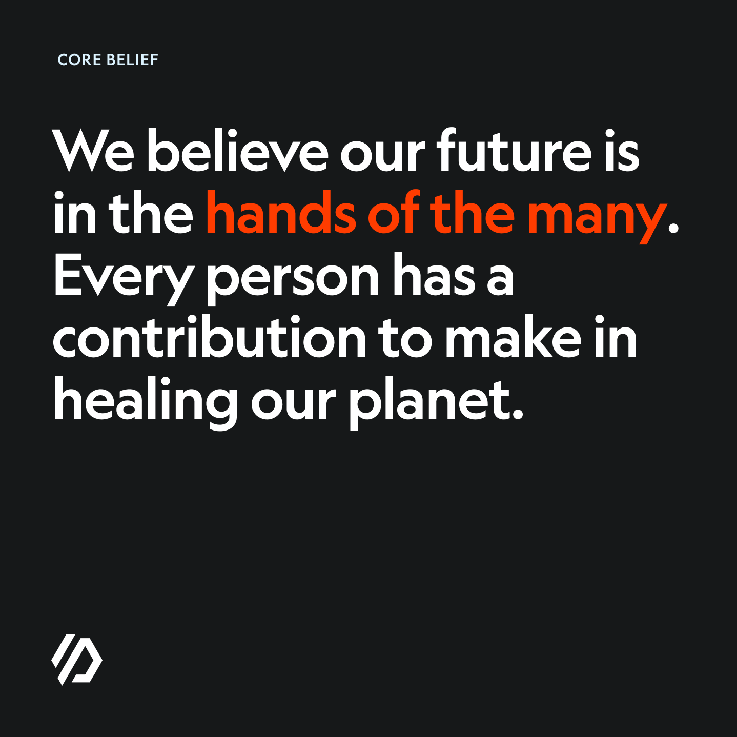
The story of our mark starts with the carbon molecule — depicted by the hexagon. We use this shape to evoke the carbon cycle — the process of carbon moving through the world from the air to trees and back to the air.
To reverse climate change, we need to break the existing cycle of excessive CO2 being pumped into the air. The diagonal line symbolises how we break this cycle. We break it by sequestering carbon in our material and preventing carbon emissions of the materials we replace.
05 · Brand expression
Bringing it all together
The last phase of our collaboration was all about bringing the work developed during the previous phases together.
We've played with the tone of voice, colour, typography and imagery to express the brand visually, creating enough assets to help Made of air communicate more effectively what they do and why they exist.
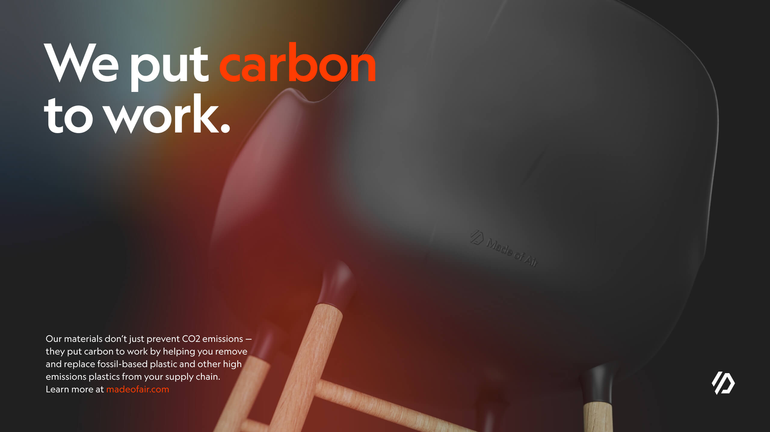
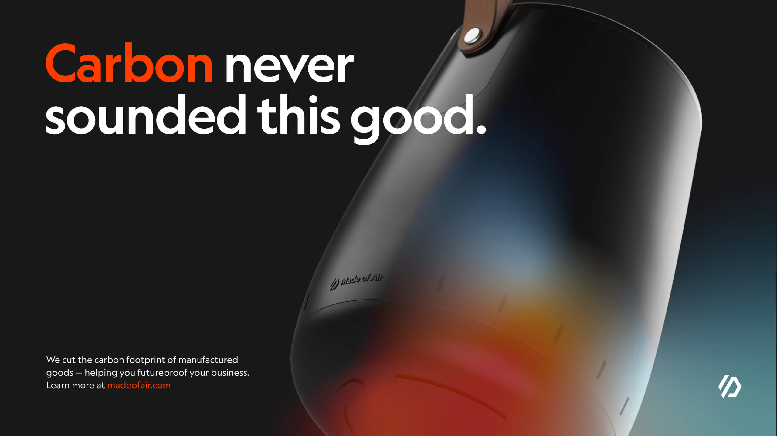
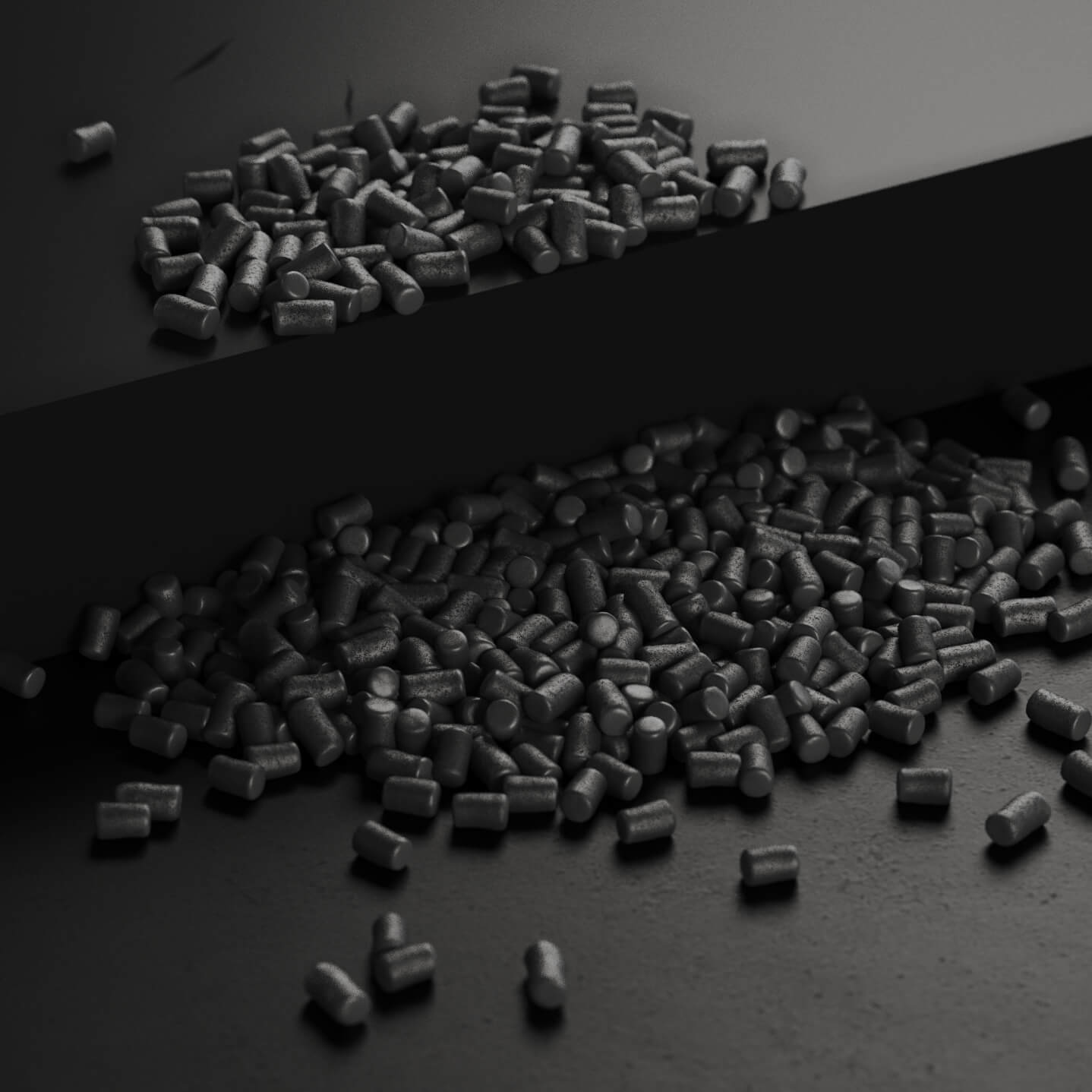
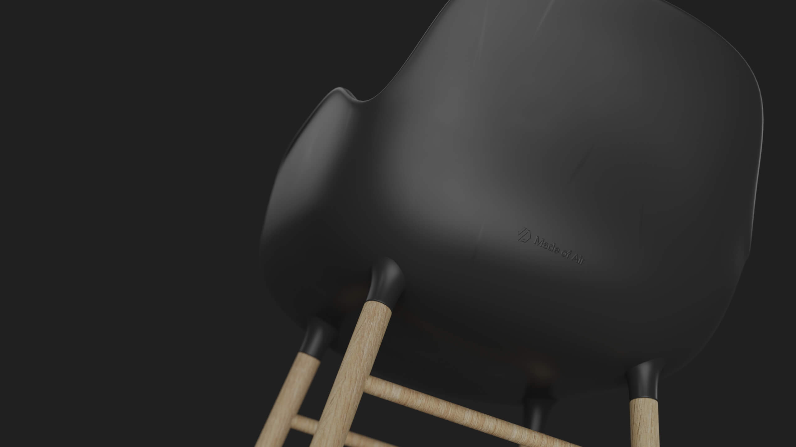
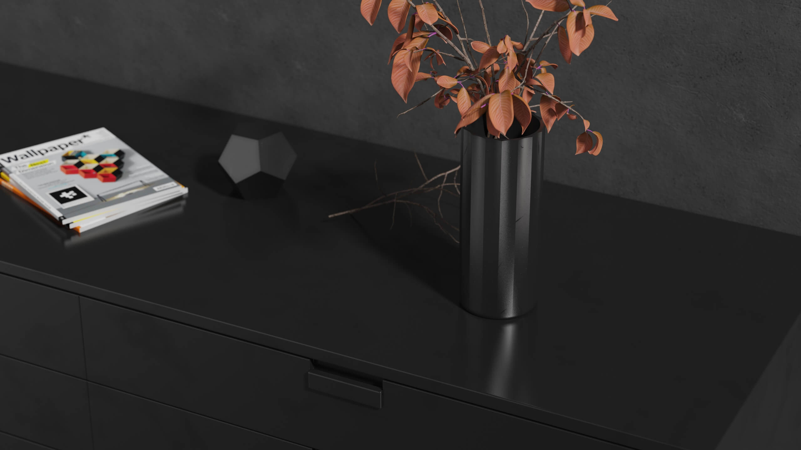
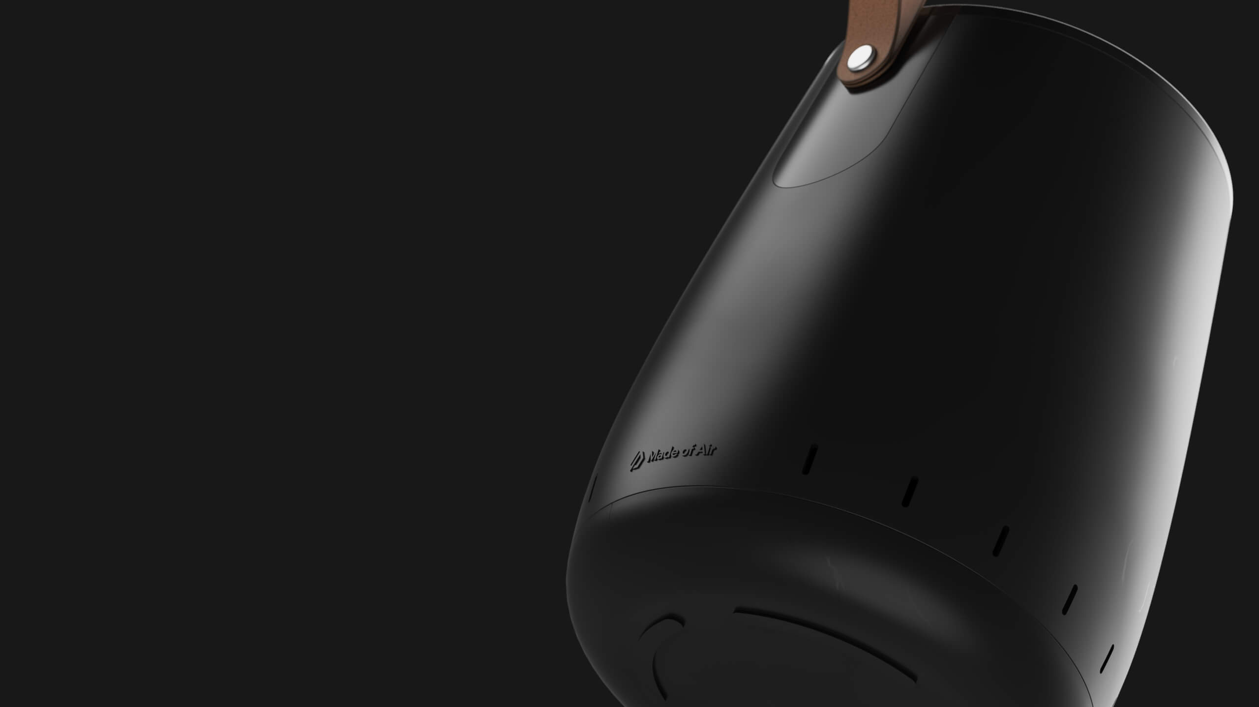
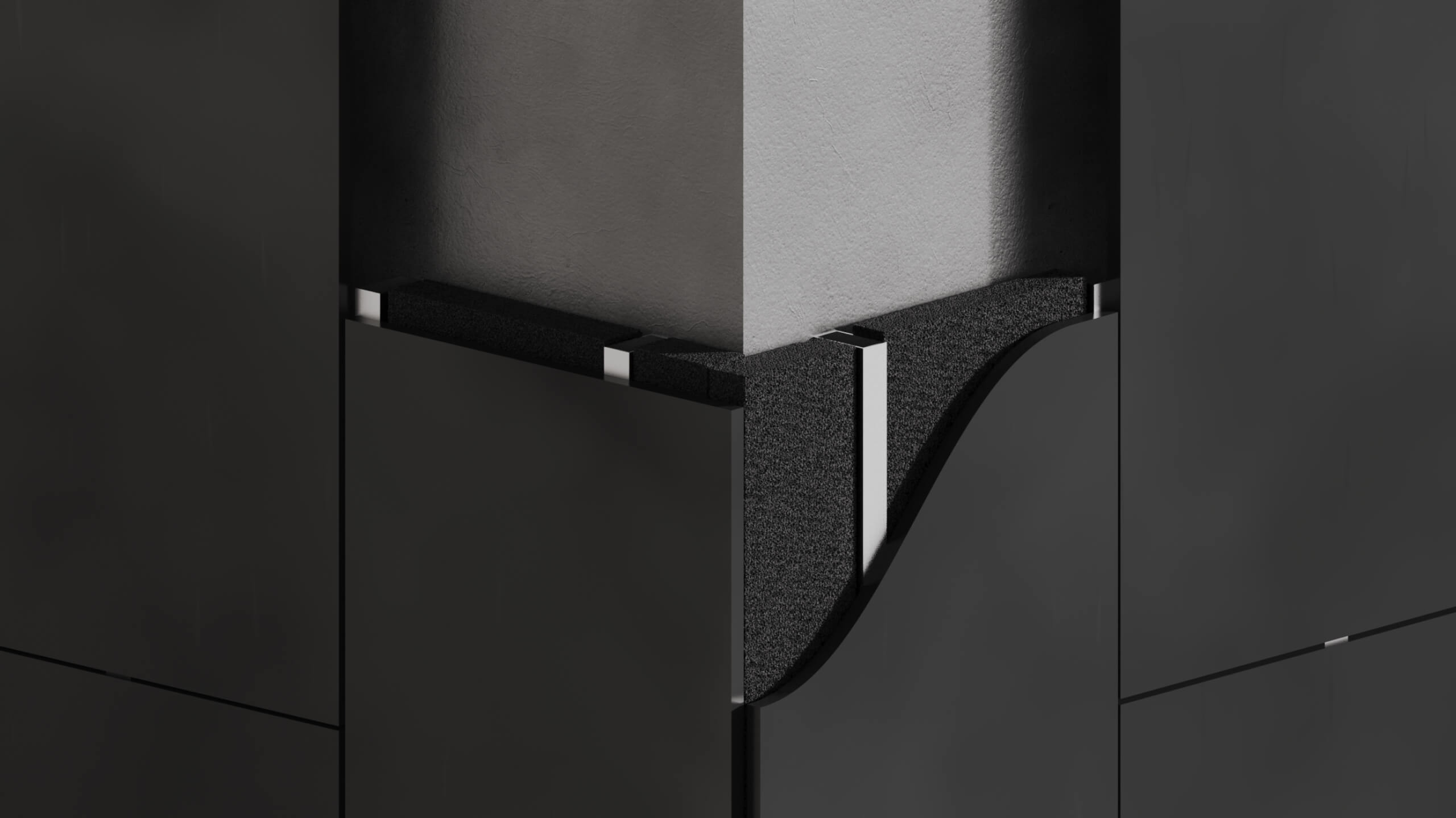
Product renders
To help Made of Air better communicate the versatility of their material next to clients and partners, we’ve created an archive of dozens of 3D renders showcasing the material in applications across different industries: automotive, architecture, furniture and consumer goods.
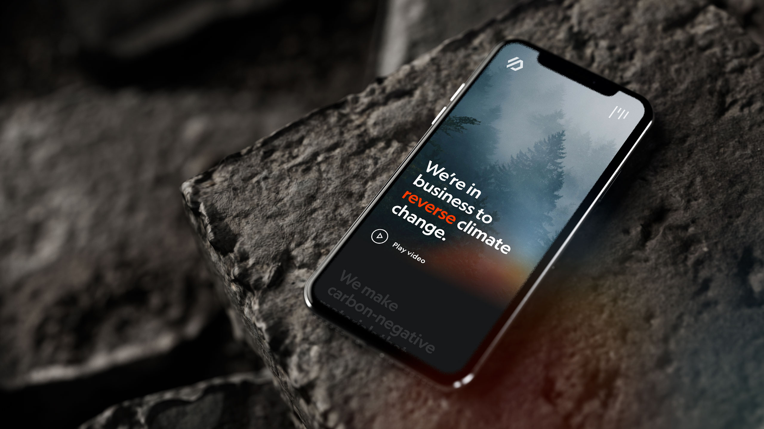
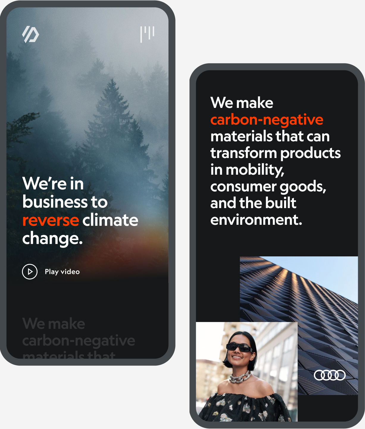
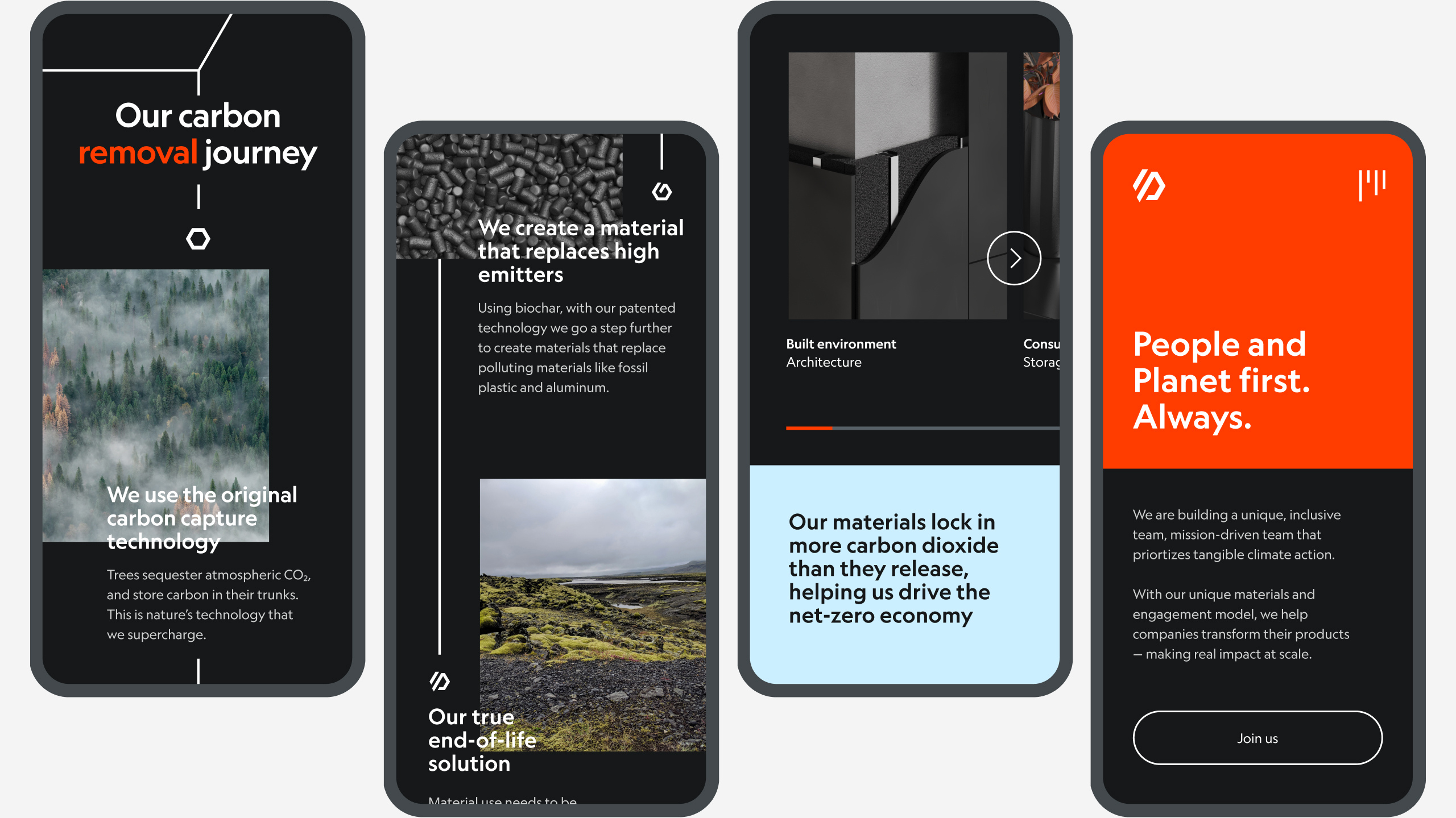
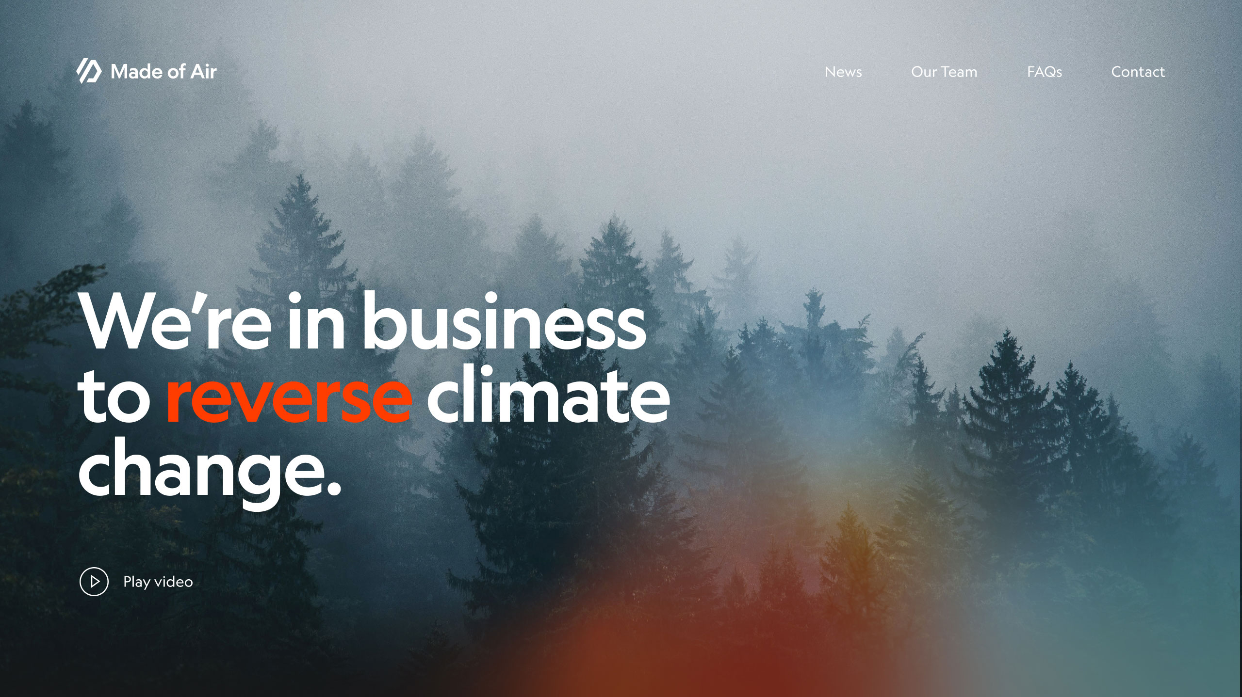
Digital presence
Within a very short timeframe, we’ve created a new splash page for Made of air. We've focus on the brand narrative and how to convey it through interactive storytelling.
While scrolling, users can learn about the origin of the materials, the processes behind making biochar, the impact they have on products and the climate, and responsibilities towards the end-of-life cycles.
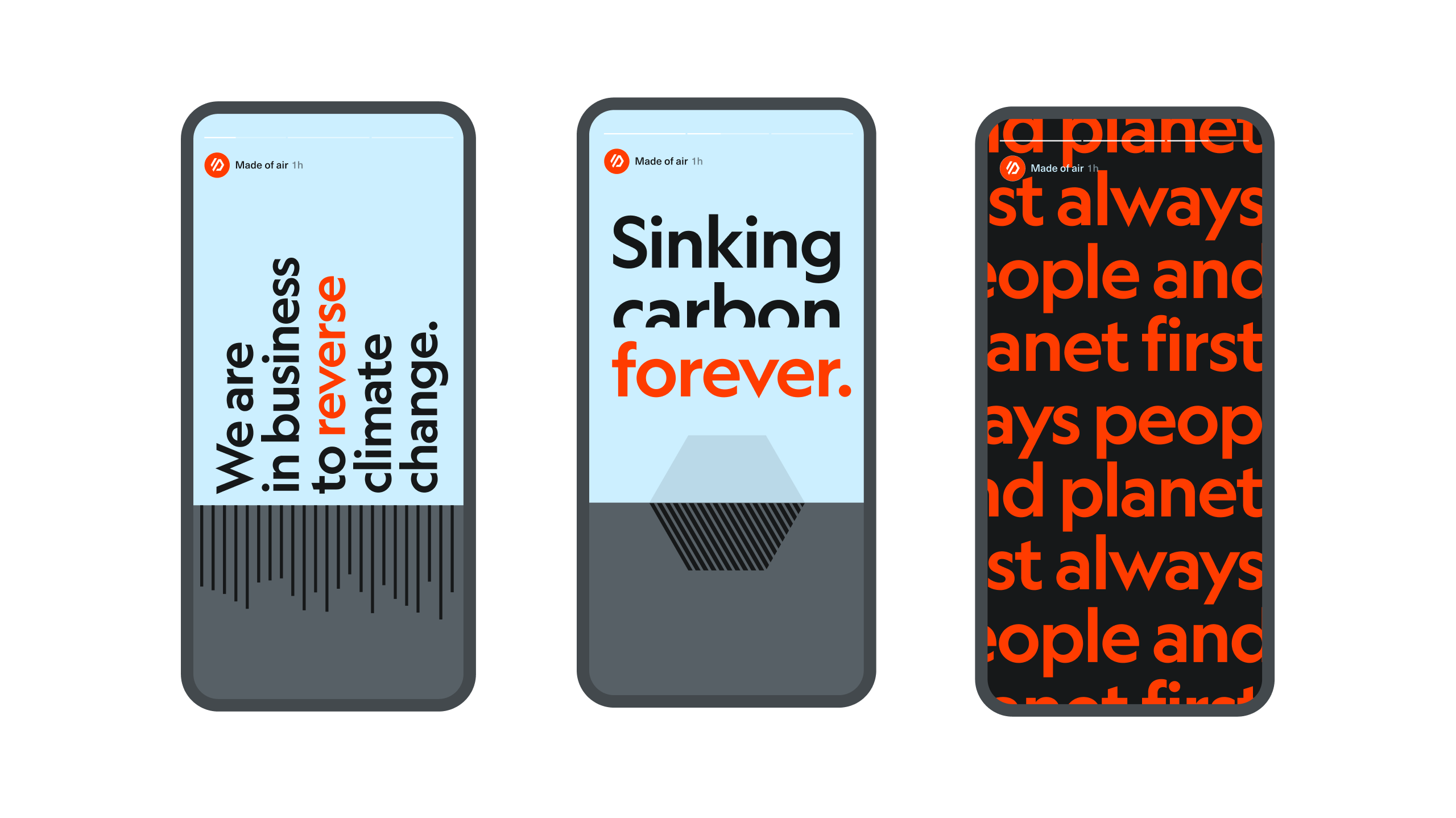
Social media
Art direction for potential illustration and and social media narratives.
06 · Client feedback
A great project and a wonderful client
Reexamining all that we did, it’s pretty mind blowing (…). We’ve already gotten a speechless reaction from a few of our board members.
—
Neema Shams
CCO Made of air