Type
- Illustration
- System
Role
- Creative direction
- Character design
- Illustration
- 3D Modeling
Timeframe
- 6 Months
- Jan – Jun 2012
Company
- Nokia
The Squircles
I was commissioned by Nokia Berlin to illustrate 62 individual facts about 62 curated cities. These cities were featured in the editorial section of their Nokia Maps platform.
00 · Summary
Challenge
In the summer of 2011, while freelancing at Nokia as an AKQA contractor, I was asked to create a set of 53 illustrations for the editorial section of the city pages on Nokia Maps, each depicting an interesting fact about a specific city.
Outcome
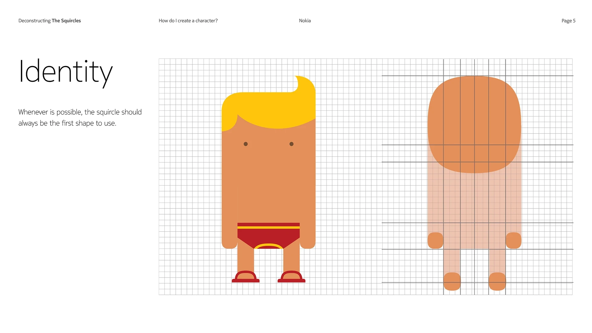
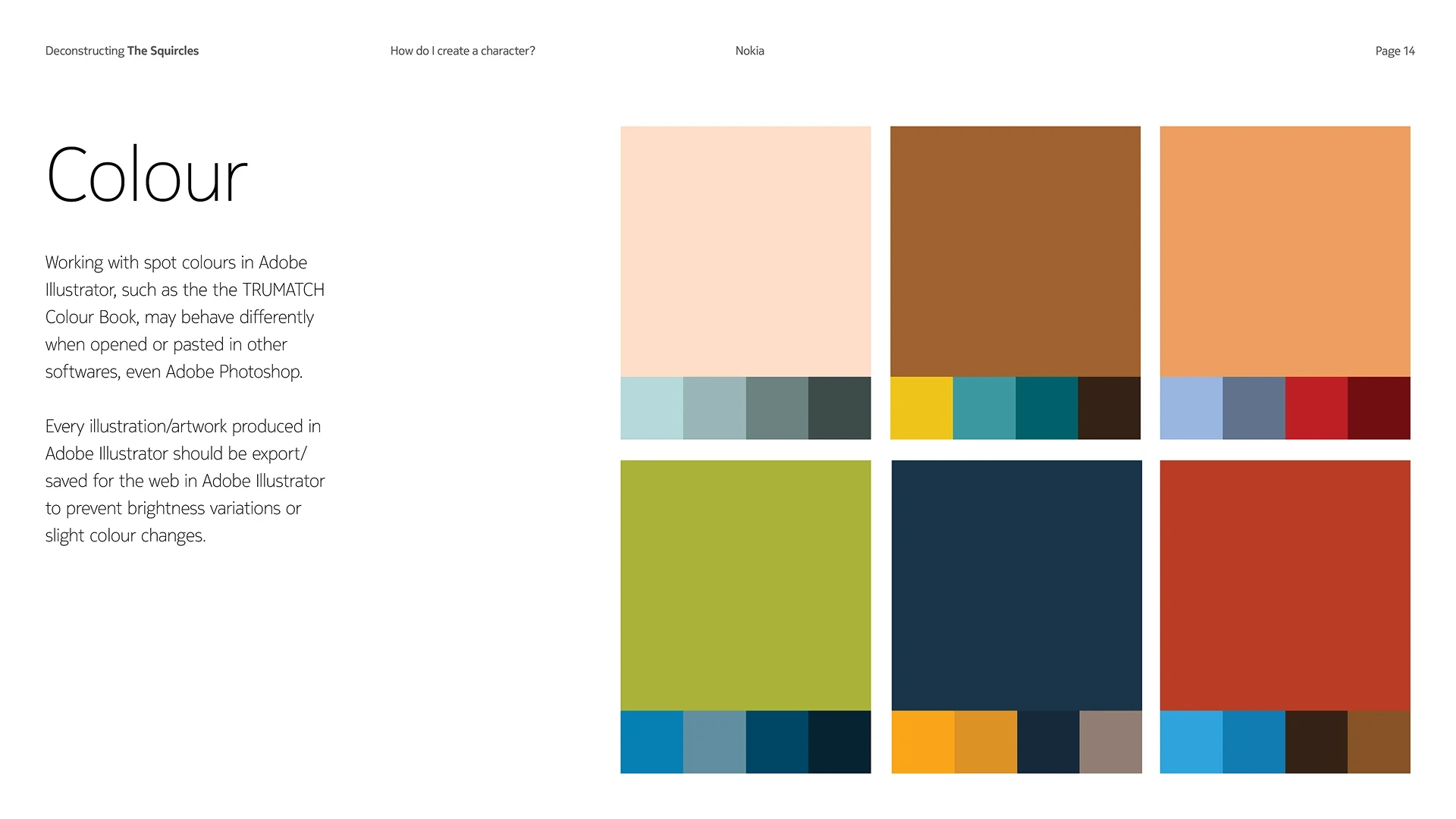
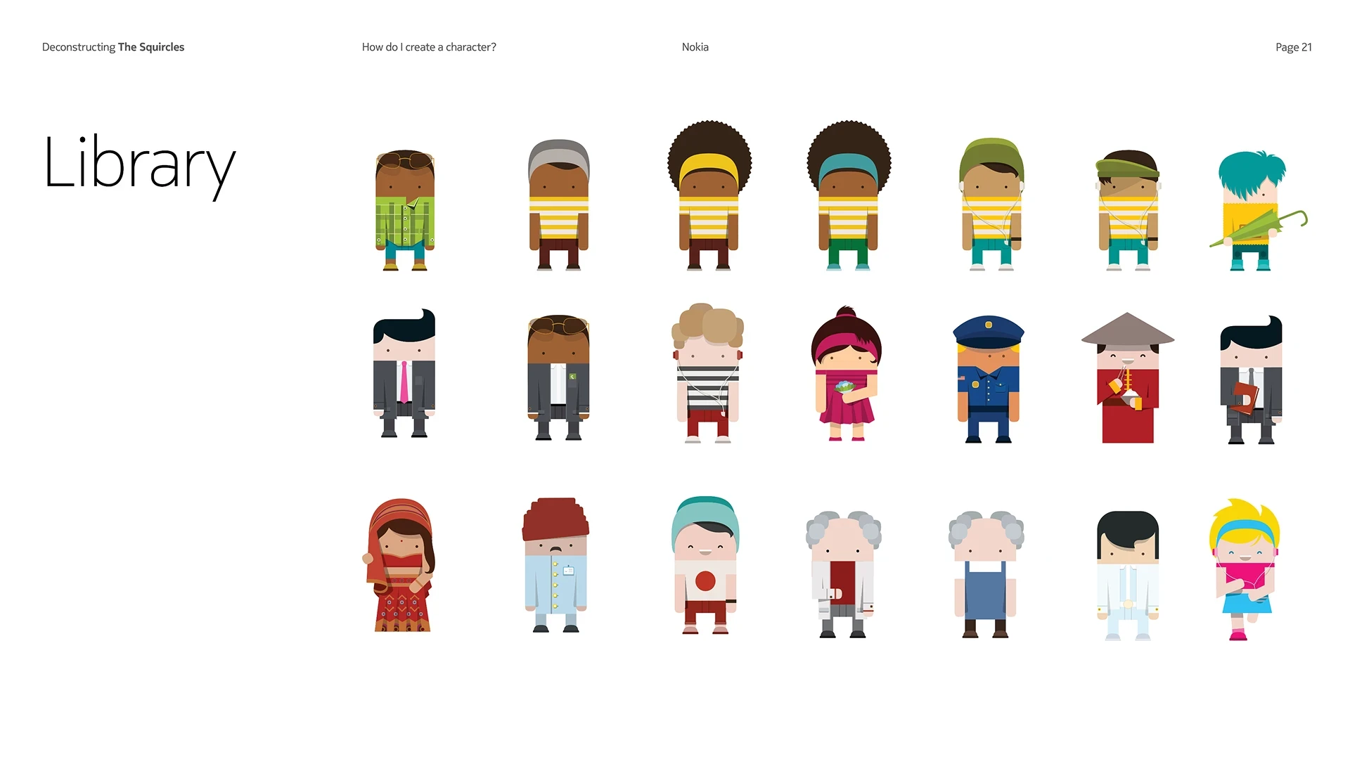
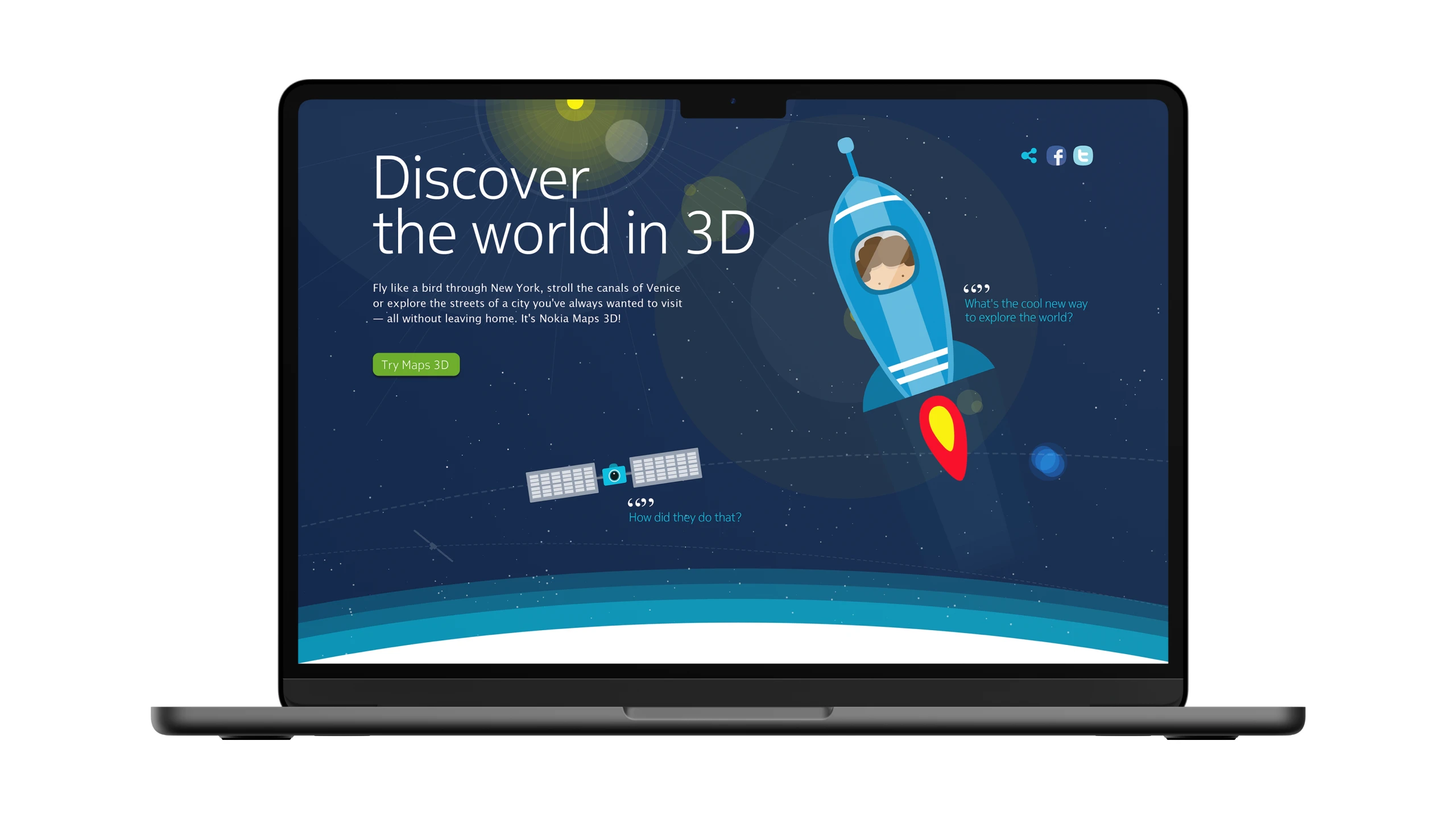
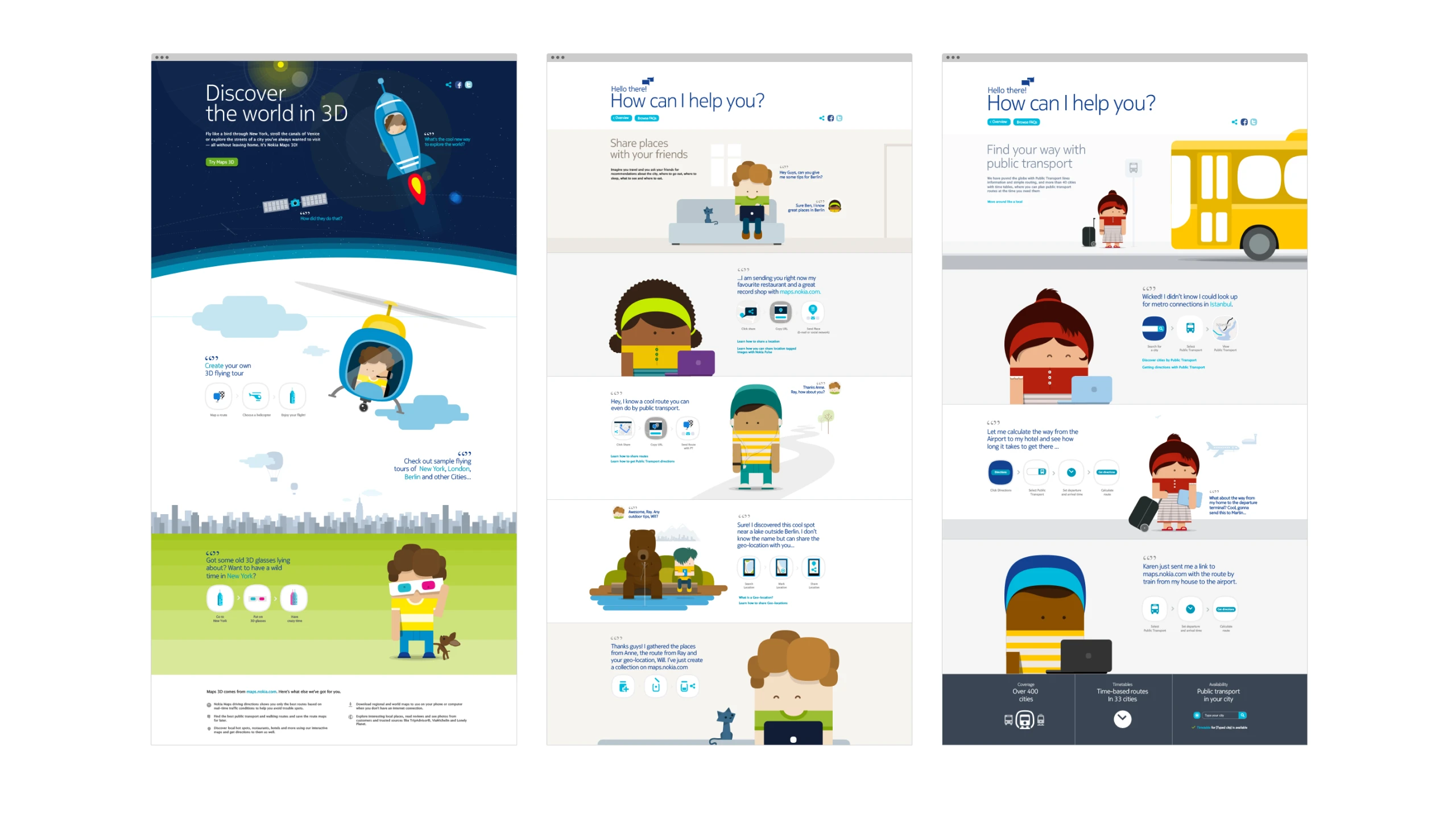
Beyond the full illustration set, I developed a comprehensive design system that enabled anyone with a vector editing tool to create a Squircle character. The Mr. Squircle character set became a Nokia patent and was widely used across its digital Maps platform, editorial content, and promotional materials.
Impact
The City Pages within Nokia Maps became the most visited editorial section in the application. The design system and visual language helped product teams align on a consistent illustration style for use across layouts and applications.
Credits
Ricardo Osório Santos
Art direction, illustration, character design
Ray Ho
Creative direction
01 · Approach
Nokia's iconic symbol
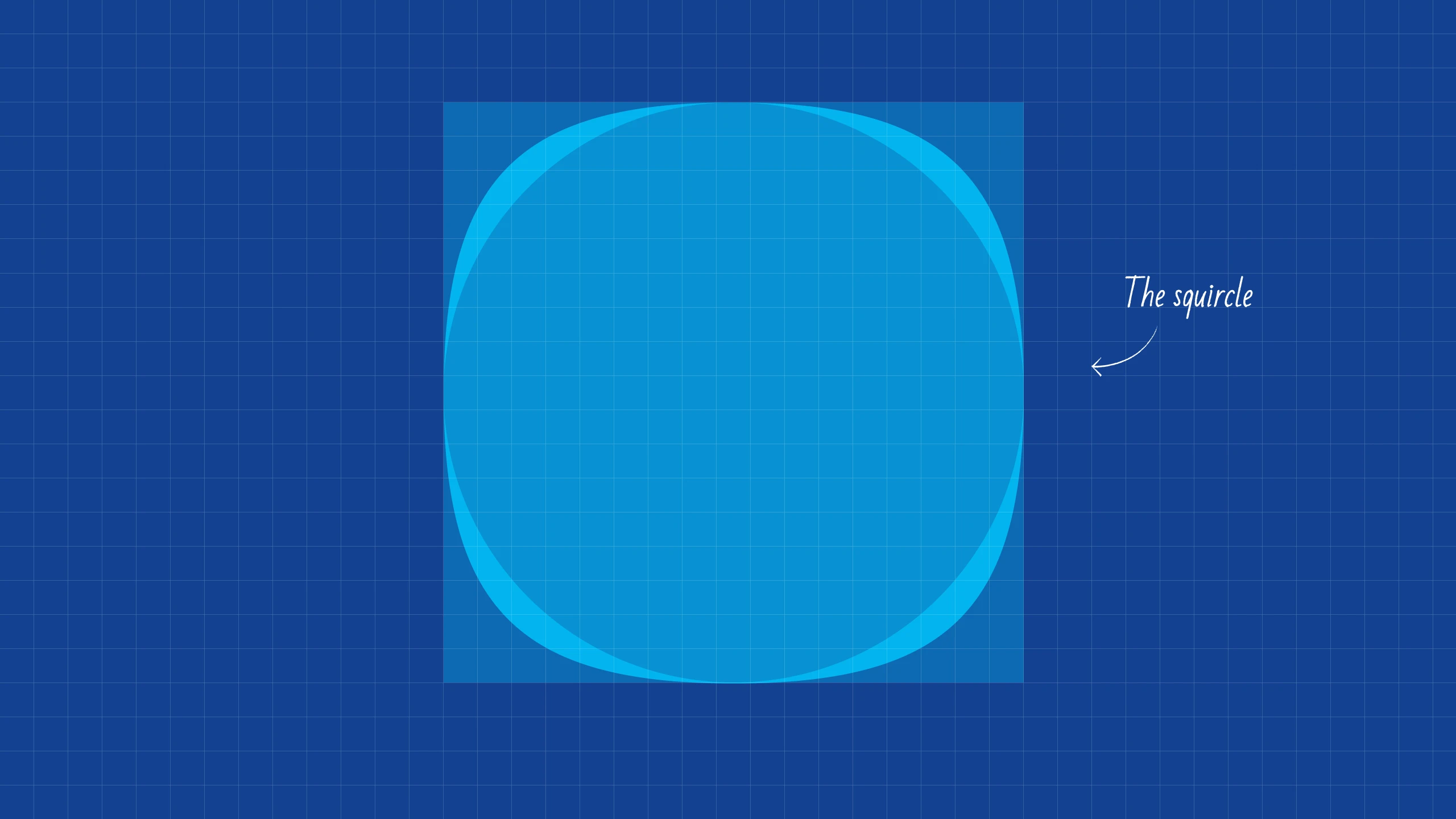
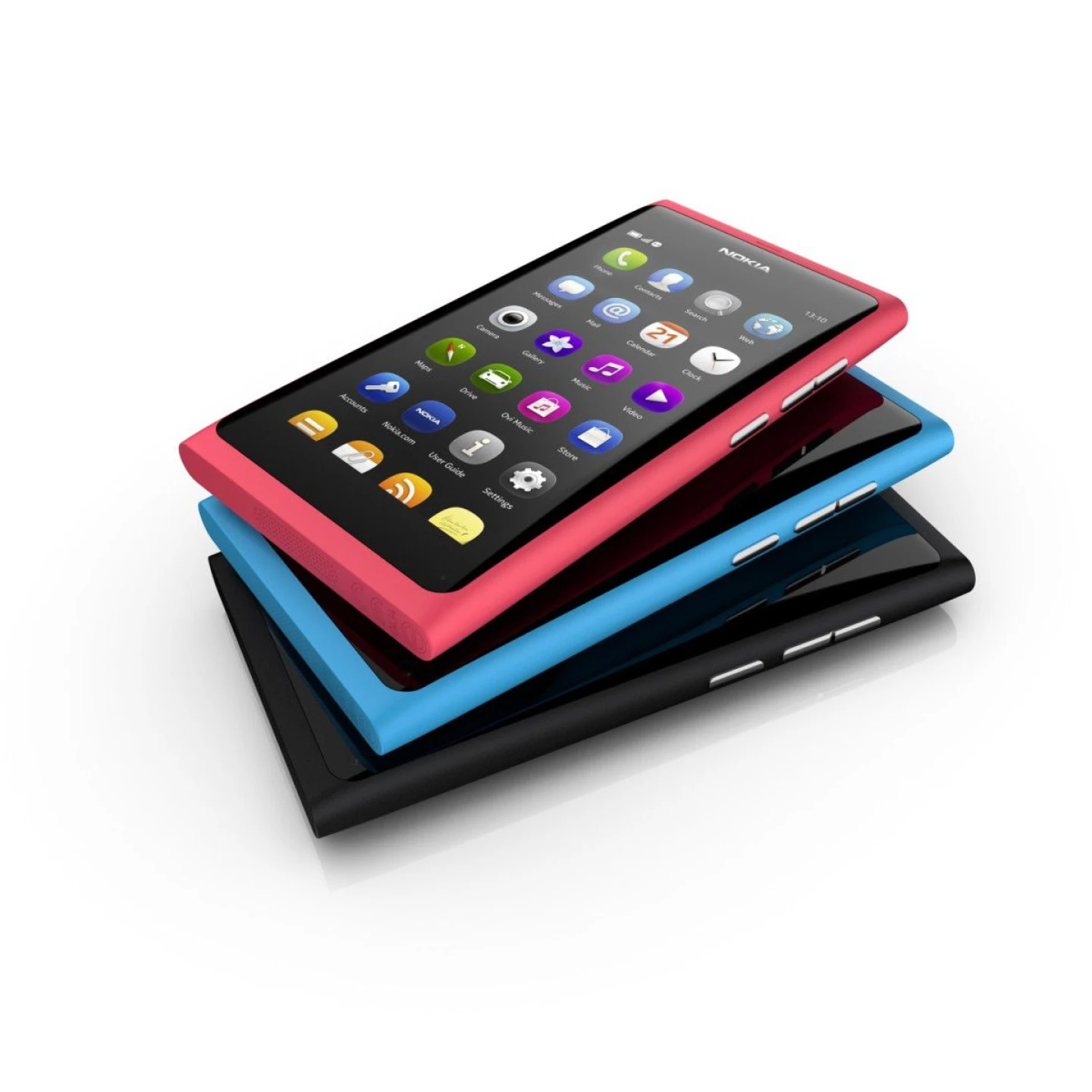
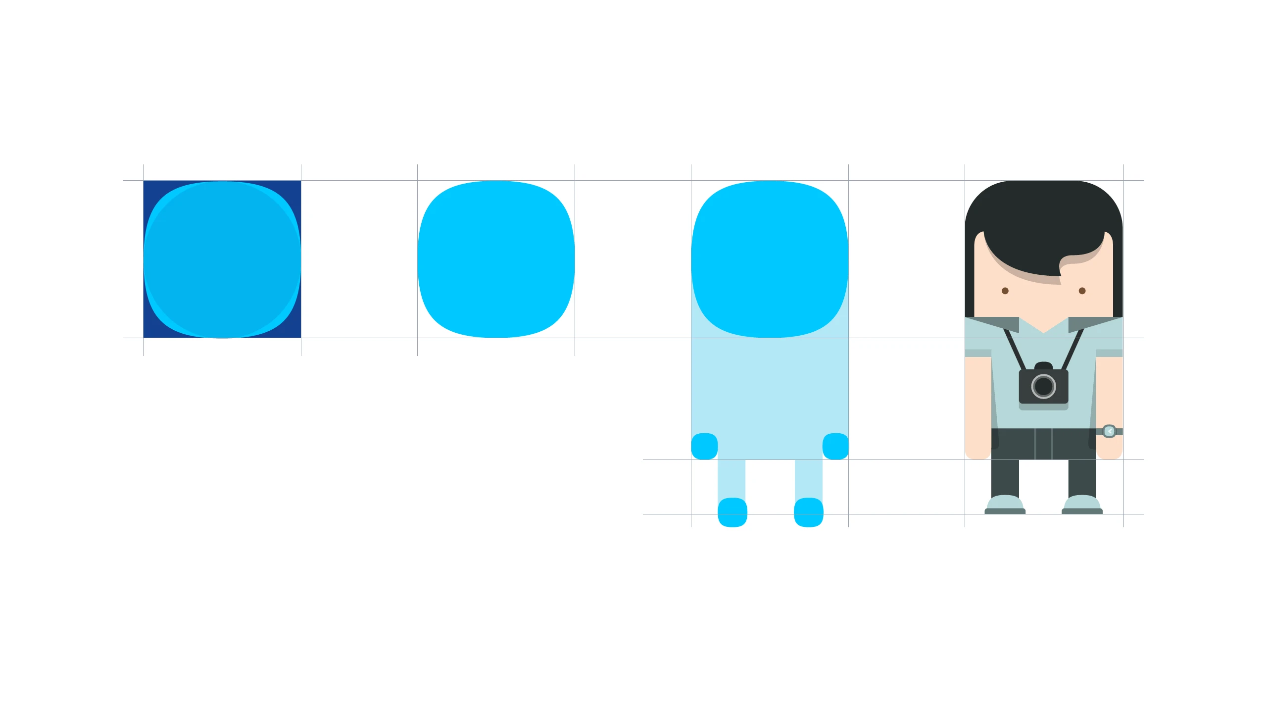
By 2010, Nokia began using a branded graphic element to differentiate itself from competitors: the Squircle. From product design to the interface of the Nokia N9, the Squircle became an iconic element for the Finnish company. My approach was to derive all characters and illustrations directly from the Squircle itself.

02 · Process
Bringing the Squircle to life
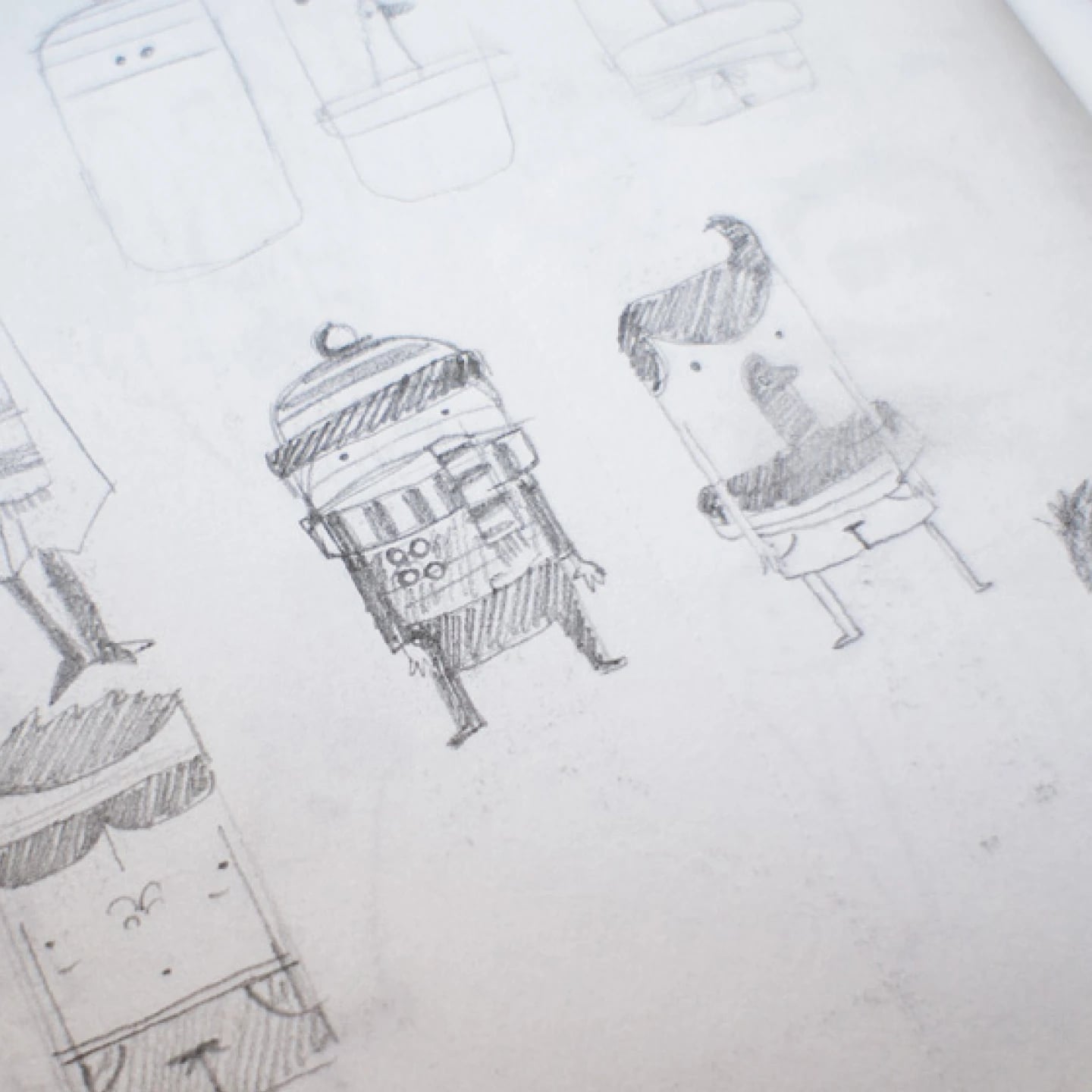
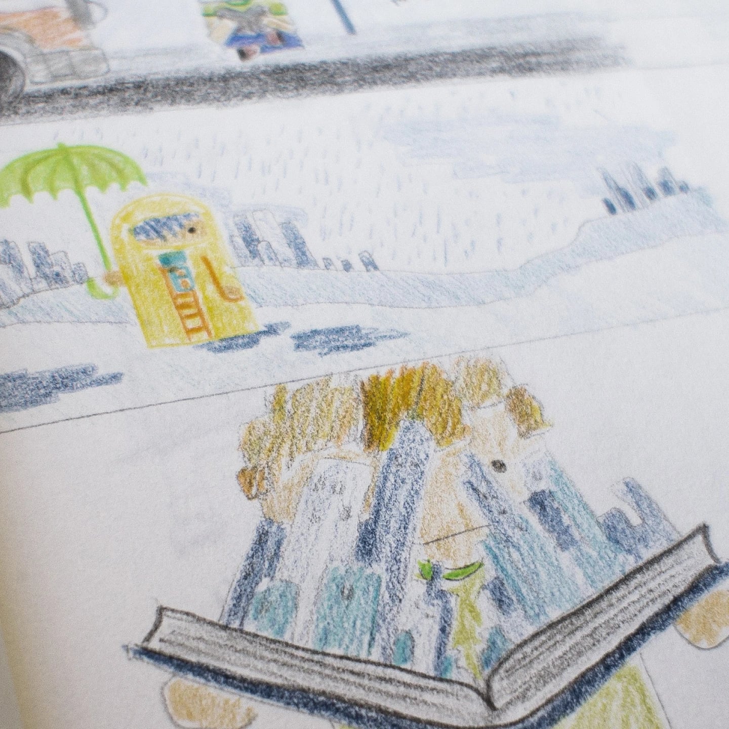
The drawing pad was my primary tool for exploring how the characters could be derived from the Squircle. Simplicity and scalability were at the core of the sketching process. Color played a crucial role in Nokia’s physical products, and I aimed to incorporate it as much as possible into the character development.

03 · Development
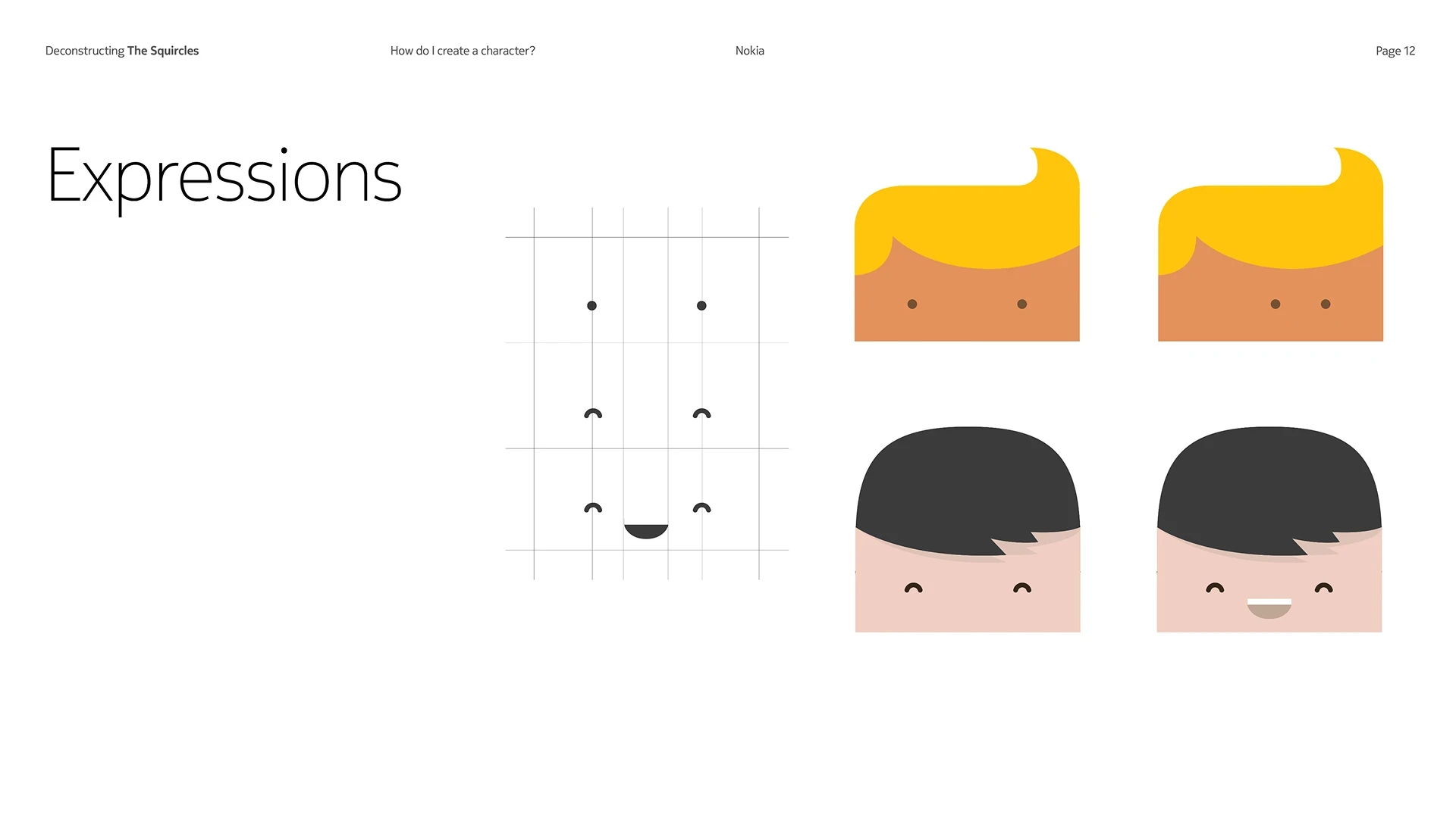
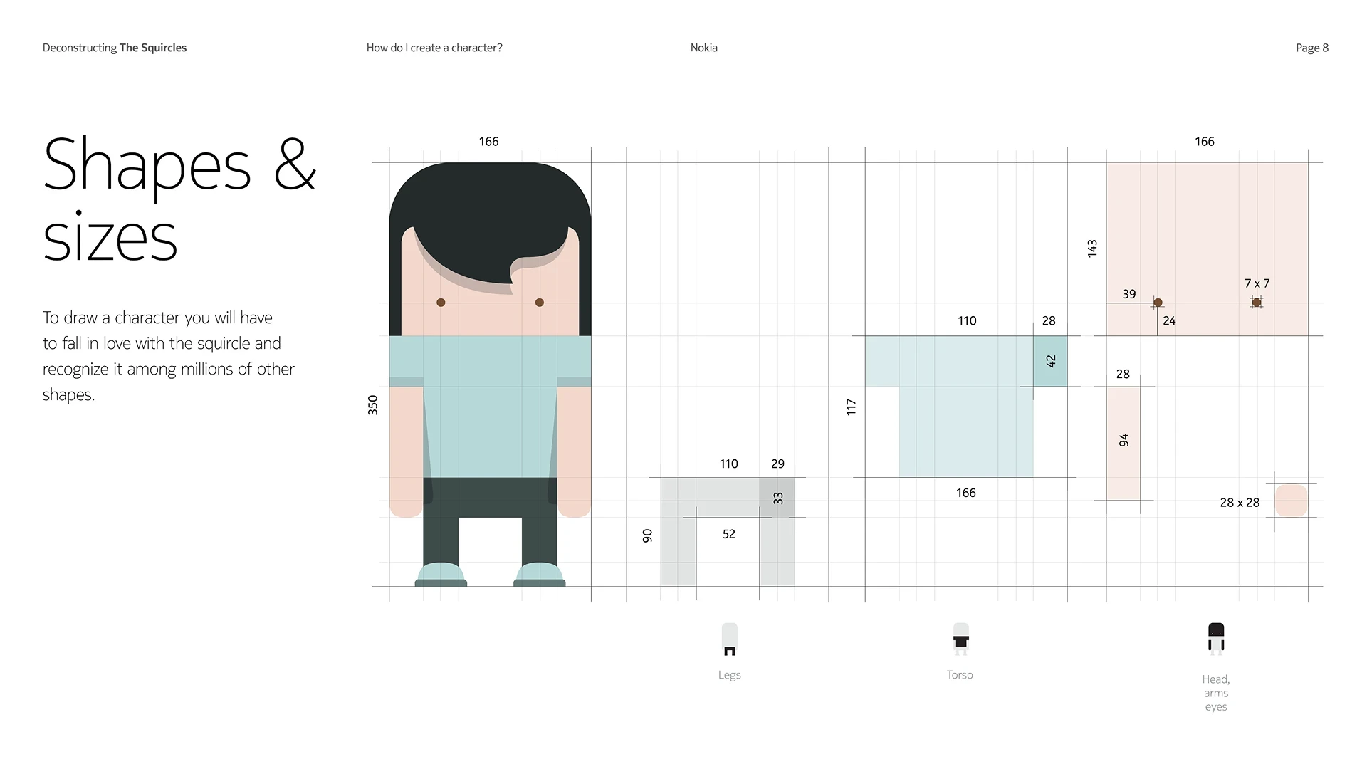
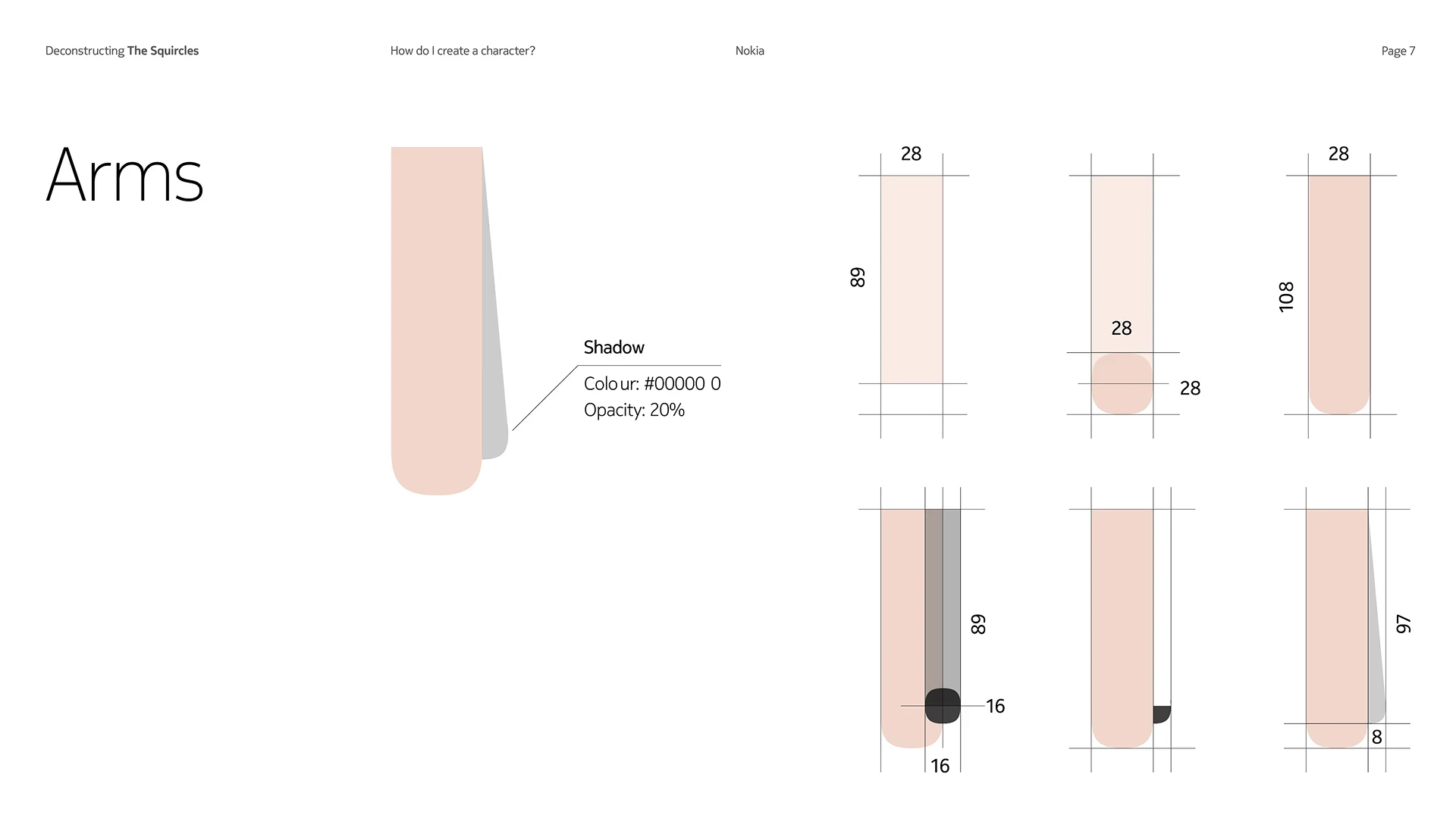
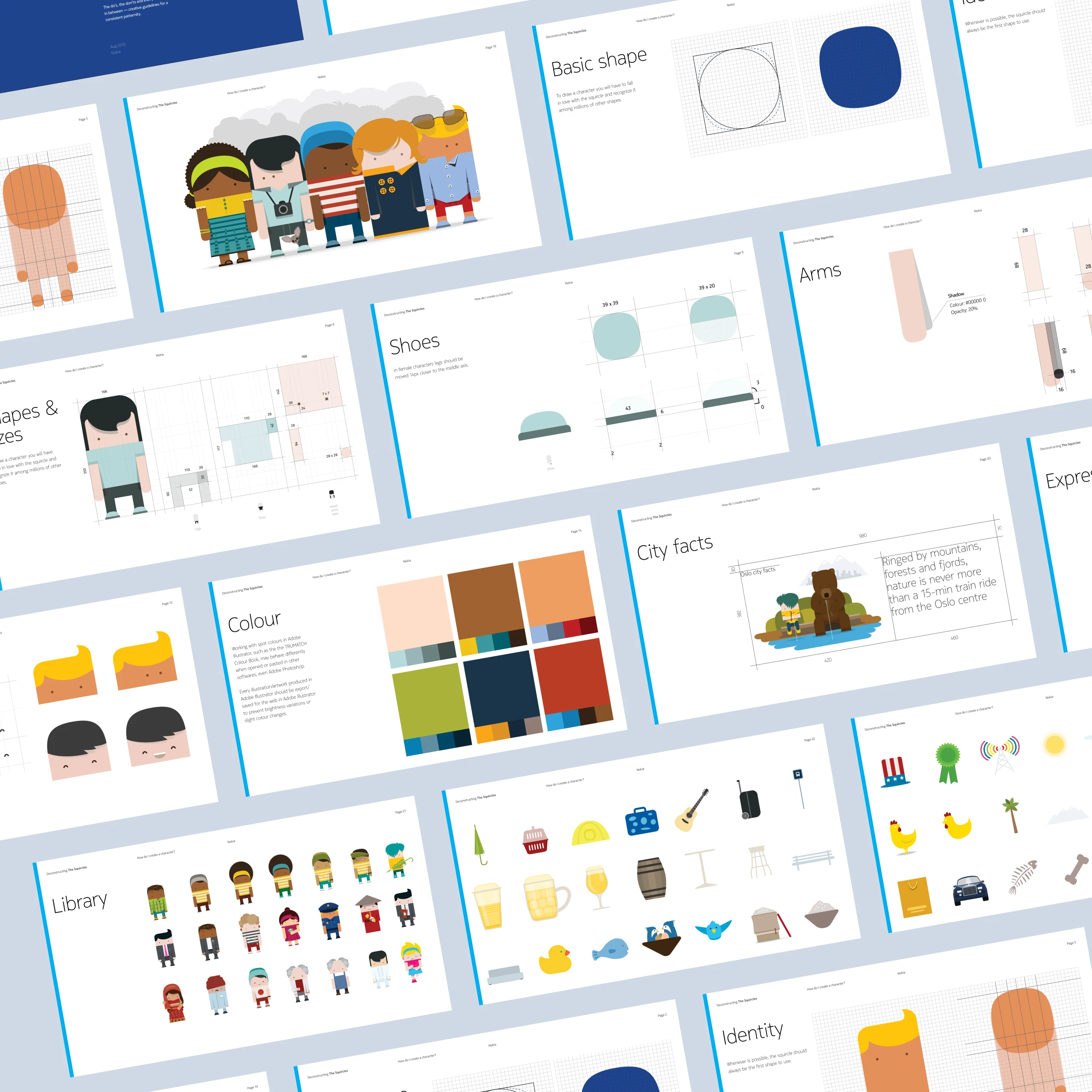
A modular character design system
Once the character shape and proportions were finalized, developing the design system became straightforward and enjoyable. It helped product teams align on an illustration style that was both on-brand and easy to execute and scale.

04 · Final delivery
The design system in context
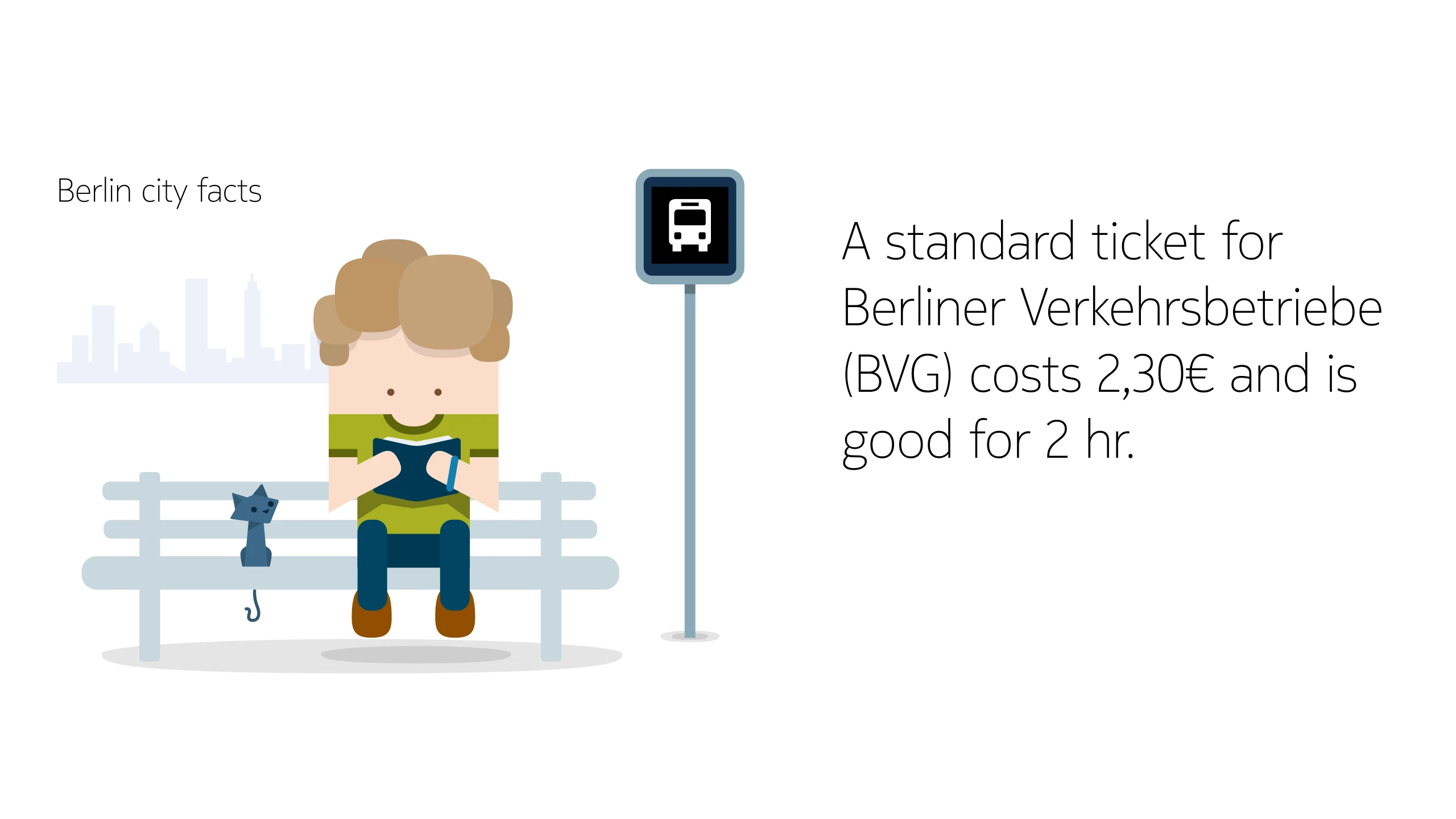
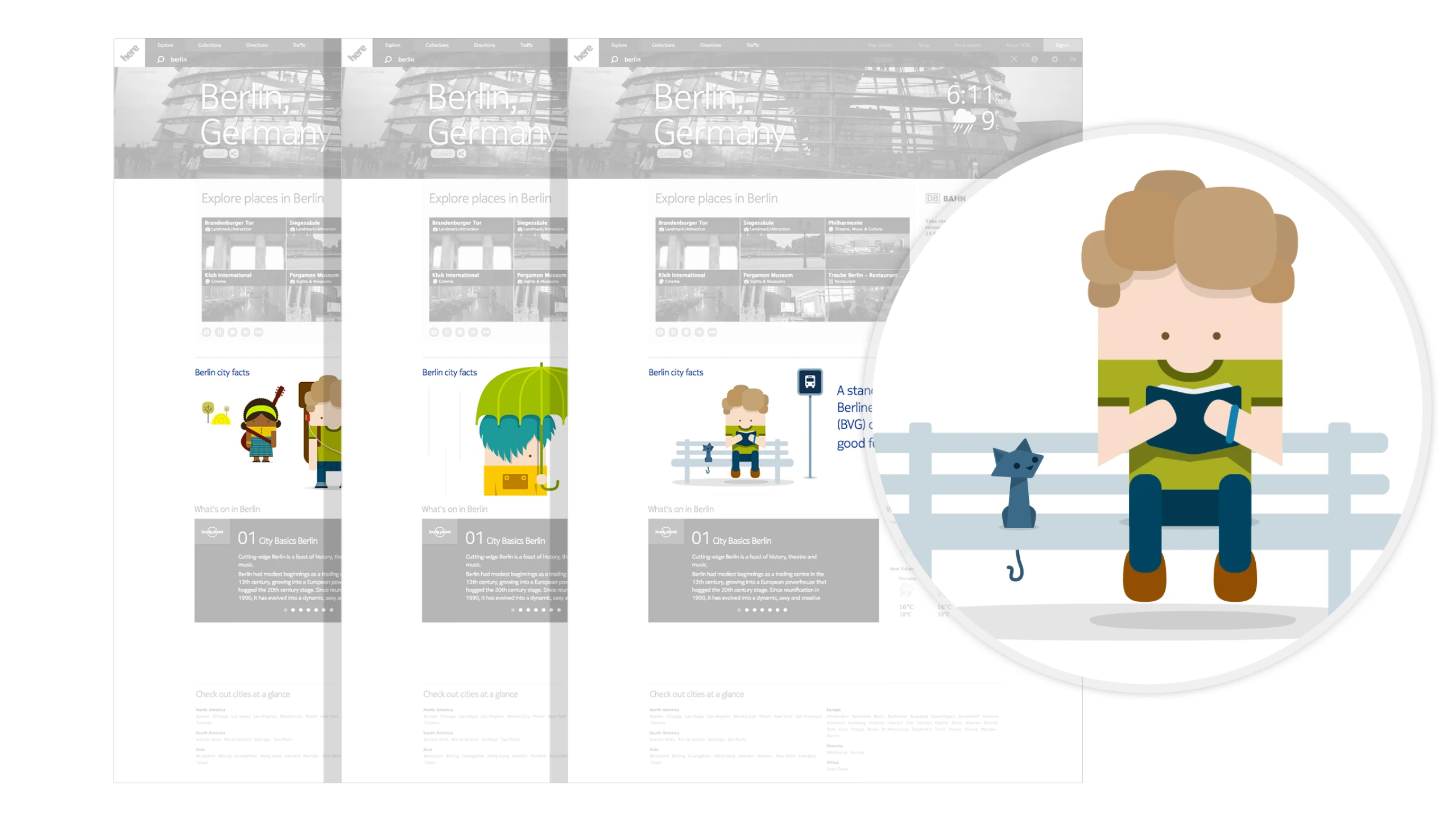
To meet the Nokia product teams’ need for illustrations, I was tasked with creating over 50 unique illustrations for the City Pages, an digital editorial product from the Maps team.
Quantification and city facts
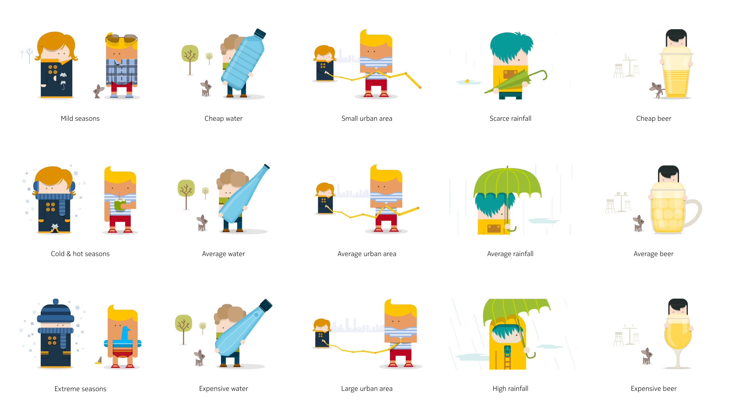
Each city featured nine generic facts, of which five were selected per city. For each fact, there were two to three variations of the same illustration—for example, the “price of beer” could be represented as cheap, average, or expensive.
One example of a city fact illustration is Hamburg: “Hamburg has more bridges than Amsterdam and Venice combined.
05 · Customer feedback
Beautiful work, Ricardo. This will be incredibly helpful for the teams, and we will finally have a library of illustrations with a unique, consistent style. Nokia will also register a patent for your work.