
- Type
- Brand identity
- Digital design
- Client
- translated
- July 2018
- My role
- Art direction
- Lead visual design
- Motion design
Translated
Translated has been offering on-demand translations for over 20 years. They invented the gig economy before it even had that name. After investing heavily in online marketing to drive growth, they found themselves left with a highly transactional brand and a product portfolio architecture that had grown organically which was confusing and not set up for future growth & expansion.

00 · Project summary
Challenge
Translated came to frog for help with overall brand strategy and brand identity, as well as an overall restructuring of their product portfolio along with a vision for their digital touchpoints and products.
Outcomes
On a brand story and purpose level, we helped the Translated team reflect and redefine what they stand for and what they want their company to be in the future.
We took an outdated brand and a portfolio of products and services that caused confusion between existing customers and emerging enterprise and prosumer customers and devised a strategy to enabled future growth.
We created a new sub-brand Translated Labs as a home for technology explorations and all their new prosumer products & services.
We delivered a totally new Brand Story, a new Brand Identity, and revamped product & brand architecture, along with a vision for their websites and digital properties.
Visit siteFull credits
- Strategy and service design
- Kevin Cannon
- Rosie Isbell
- Mariana Helguera
- Visual support
- René Mambembe
01 · Brand identity
Powered by AI, driven by people
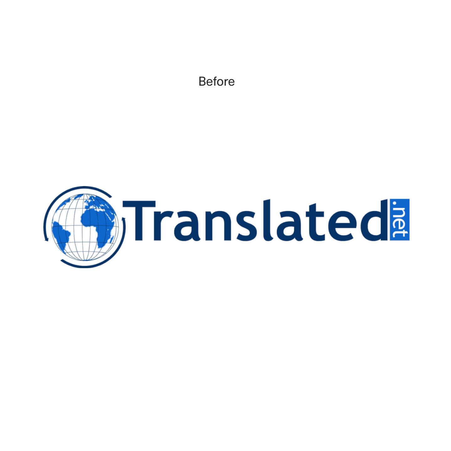
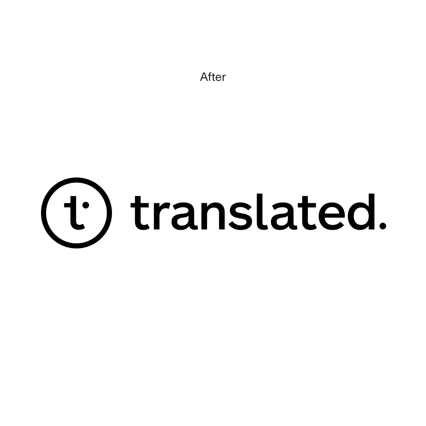
The new identity is composed of its primary mark and the logotype. It captures the idea of a human face — the “t” as a nose and a smile, while the “dot” as a meticulous eye — supervising Translated's AI capabilities.
The signature construction tries to stay close to the previous identity, maintaining some of its elements: the circle and the "period" at the end.

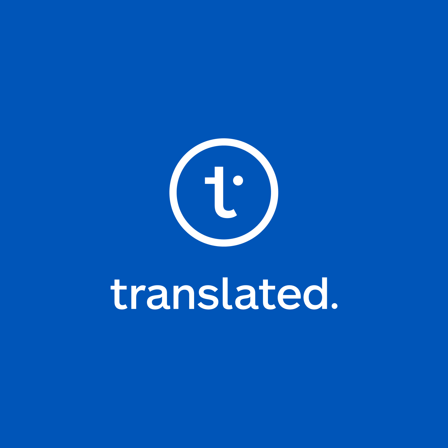
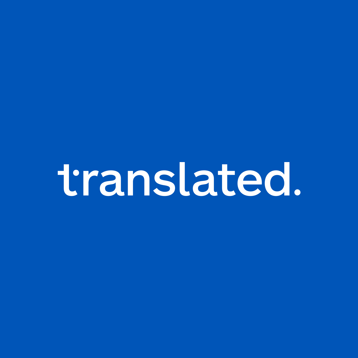
Seconday and tertiary signatures
The secondary signature is to be used on layouts where horizontal space is reduced. On the tertiary the “t” and the “dot” are now merged into the typography.
02 · Brand expression
A new visual language
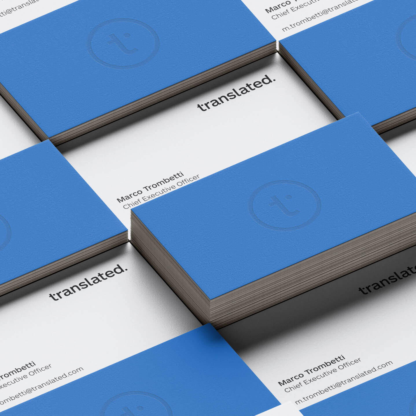
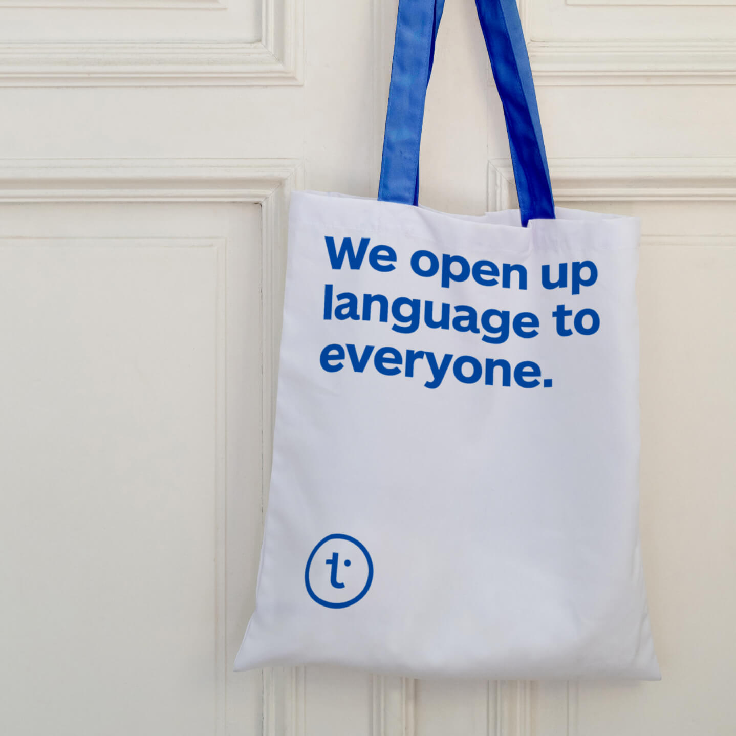
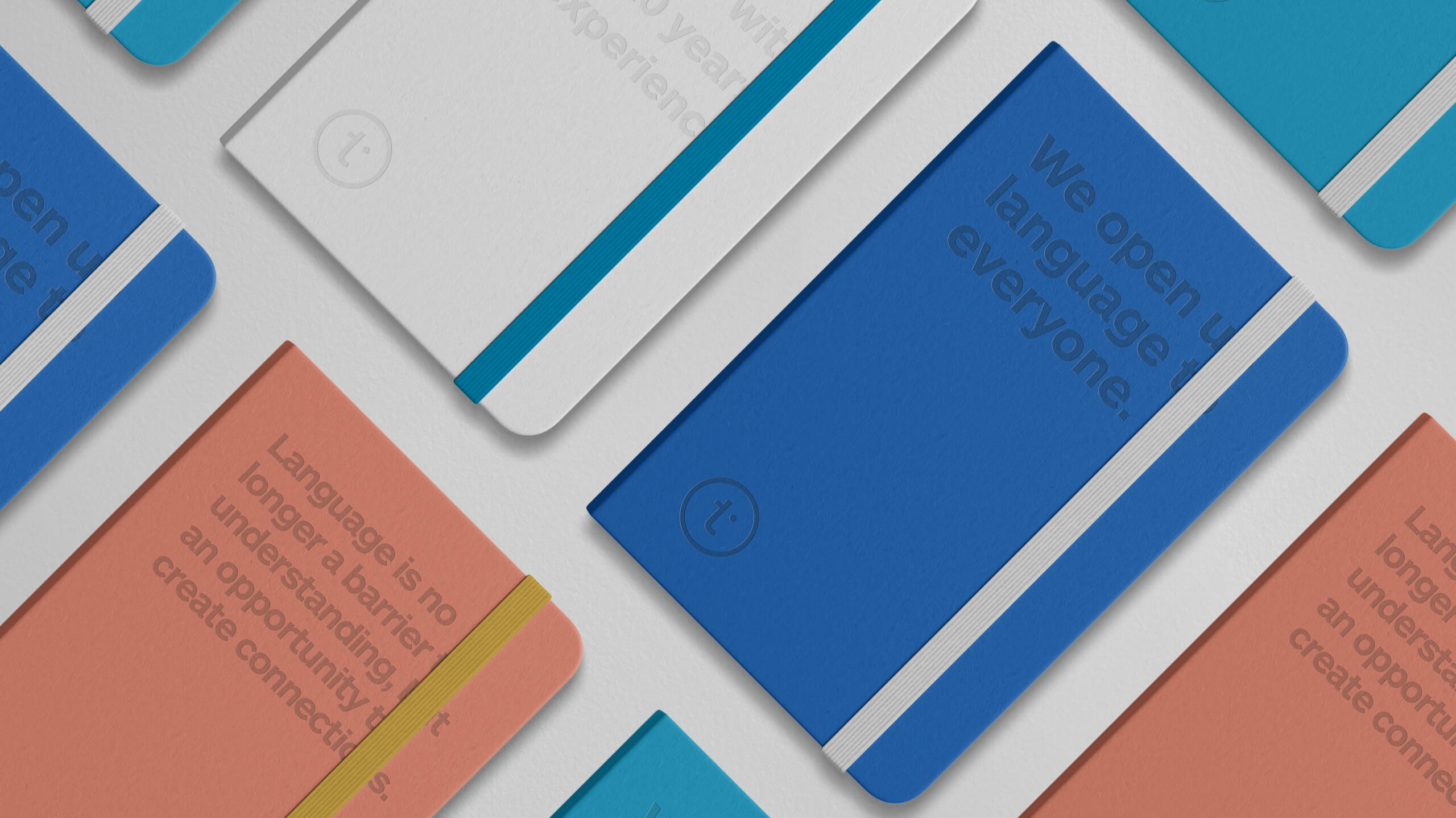
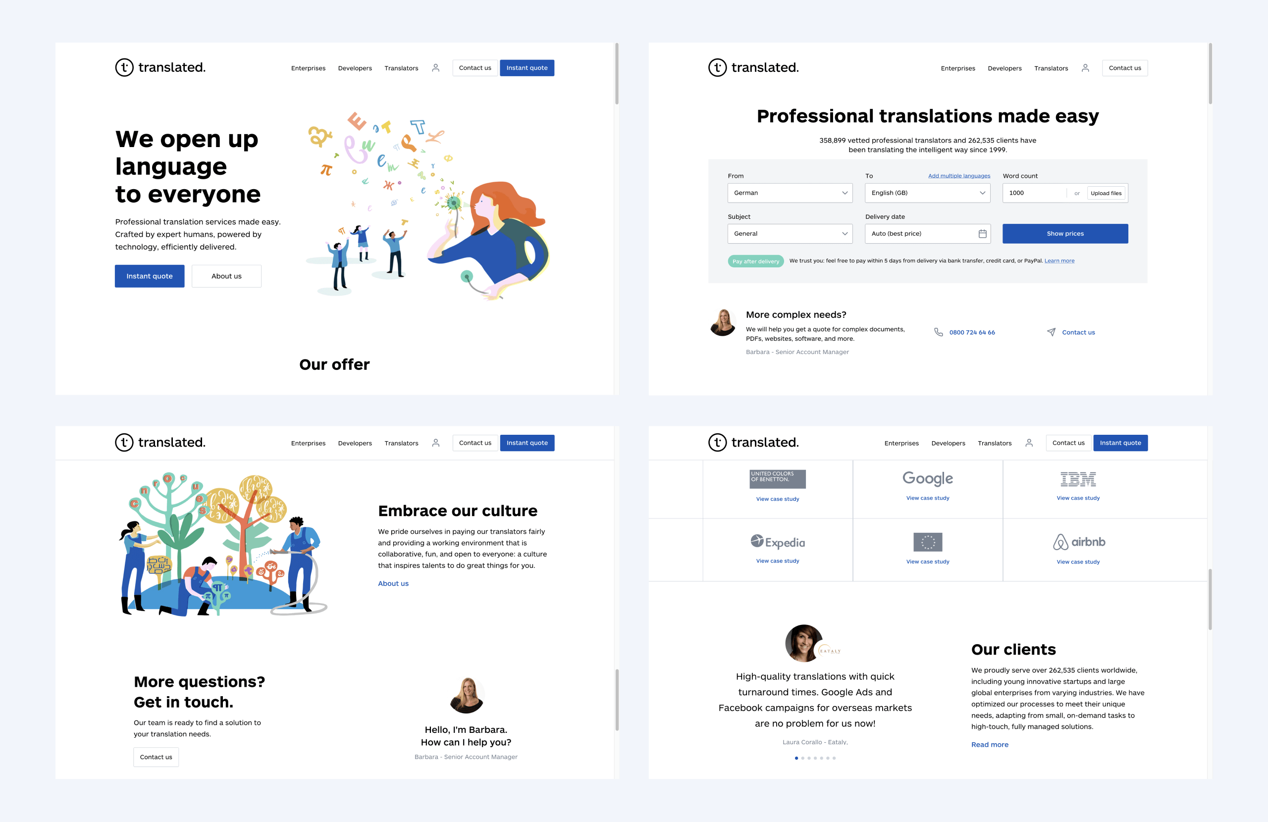
Showcasing a fresh, modern and accessible visual identity for the brand, the new Translated.com and all digital touchpoints speak directly to the various audiences engaging with the business.
The streamlined site structure now acts as a communications hub that guides translators as well as individual and enterprise customers to finding the particular services of use to them, with clear opportunities to get in touch.


03 · Design system
Scalability for current and future products
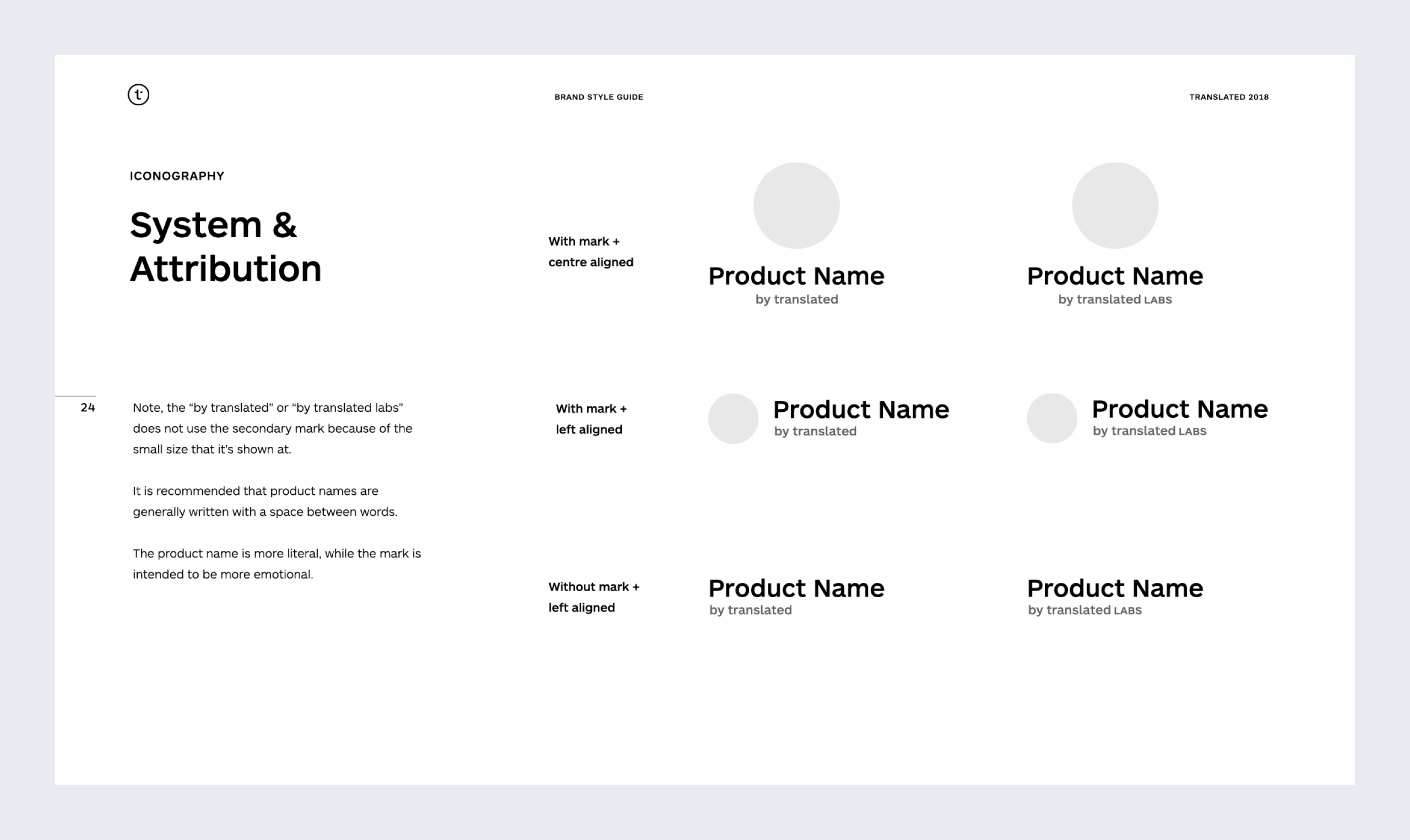
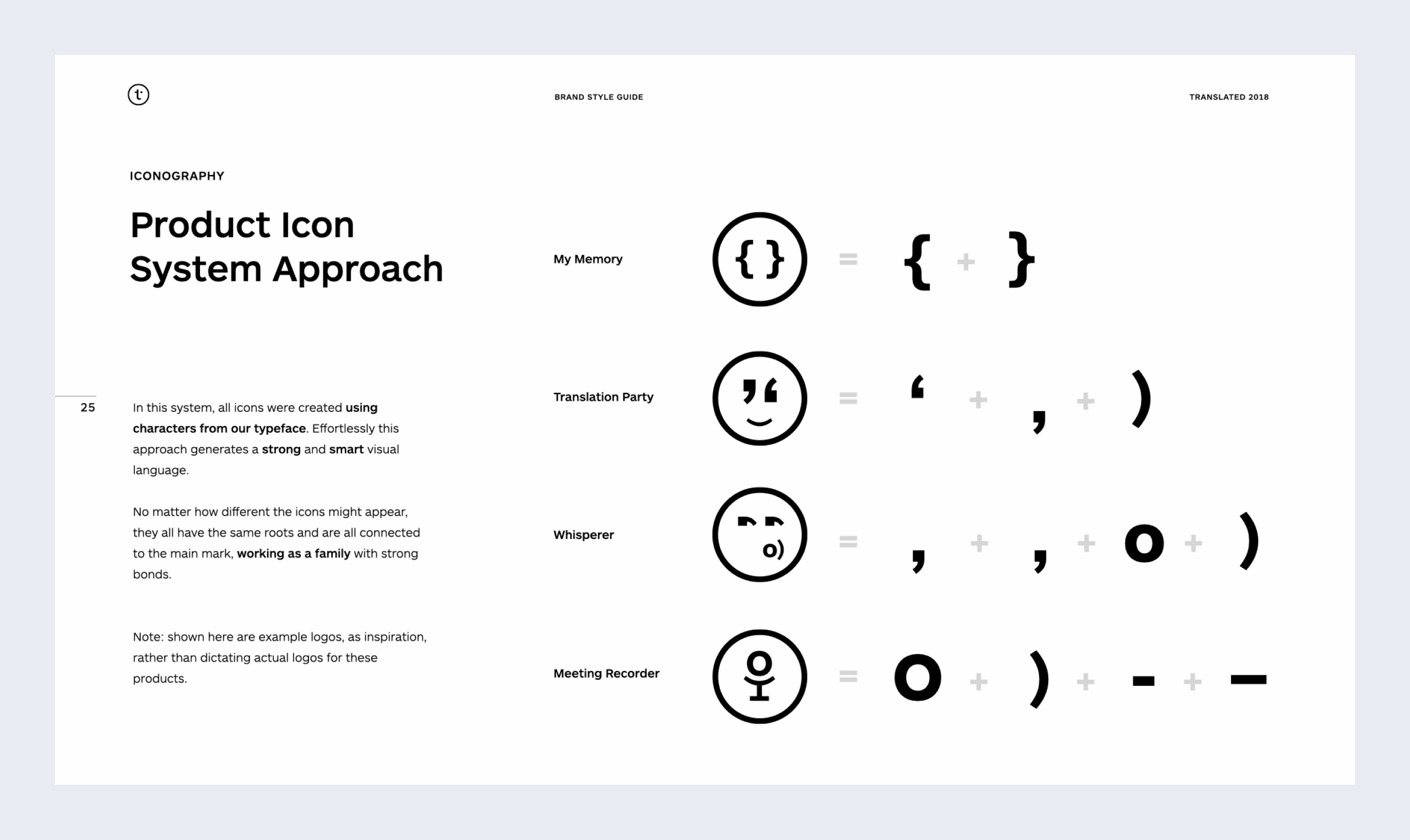
Translated needed a visual system to allow them to quickly generate in-brand logos for their future products. Besides the new sub-brand Translated Labs — the home for technology explorations and all the new prosumer products and services — which was tailored by us, we've created a simple system that would ensure the new products would feel part of the family.


04 · Brand expression
From a brand playboook to an award winning campaign
In 2020, Translated has launched the company's first ever brand campaign which connects with the most precious human element of all: language — Credits: AUGE, Milan.
06 · Client feedback
A trully collaborative process
Everyone on the team at frog has done amazing work, understood our goals and challenged us where needed. We felt like they have always been part of our team.
—
Marco Trombetti
Co-Founder and CEO